
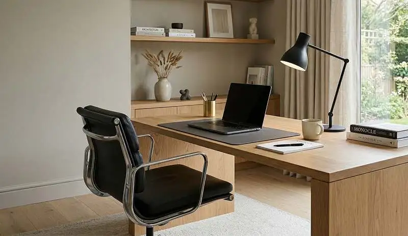
Design often gets pushed into a false choice. Either a product looks beautiful, or it works well. In reality, strong design demands both. A stylish object that frustrates users will not last. A highly functional product that feels clumsy or visually flat will struggle to connect with people.
Many designers face this tension in real projects. They want to create something elegant, memorable, and modern, but they also need it to perform, solve problems, and fit real user behavior. That tension is not a flaw in the design process. It is the process. The real skill lies in managing both sides with intention.
In this article, I will break down how form and function can work together without sacrificing style. We will look at the relationship between visual appeal and usability, the principles that support balanced design, common mistakes that weaken outcomes, and practical strategies designers can use in product, digital, and spatial work. By the end, you will have a clearer framework for creating designs that look refined and work beautifully.
Learn more about: Voice User Interface Design
Key Takeaways
- Form and function should support each other, not compete
- Style becomes stronger when it grows from purpose
- User research helps prevent attractive but ineffective design decisions
- Simplicity improves both usability and visual clarity
- Good design choices often come from restraint, not excess
- Testing and iteration help refine both appearance and performance
- The most memorable designs are usually the most coherent ones
Understanding the Relationship Between Form and Function
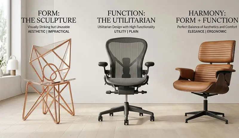
Form and function are two of the most discussed ideas in design, yet they are often misunderstood. Form refers to the visible qualities of a design. It includes shape, color, layout, material, texture, and visual language. Function refers to what the design does and how effectively it serves its purpose. A design succeeds when these two elements reinforce one another.
A chair is a simple example. Its silhouette, finish, and proportions create visual appeal. That is form. Its comfort, stability, and support define function. That is utility. If the chair looks stunning but feels awkward after ten minutes, the design fails. If it is useful but unattractive, it may still be ignored in a competitive market. Strong design solves both problems at once.
This relationship matters because users do not experience design in separate layers. They do not first judge style and then later judge function as two isolated events. They encounter everything at once. They see, touch, use, interpret, and remember the whole experience. That means aesthetics influence usability, and usability influences perception.
In my experience, the best designs do not treat function as a technical requirement added after the visual direction is set. They treat function as a source of style. When a design clearly reflects its purpose, its beauty feels more natural and convincing.
Why This Balance Matters More Than Ever
Today, users expect more from products and environments. They want things that work quickly, feel intuitive, and also align with their values and tastes. A digital dashboard must be easy to navigate, but it also needs to look trustworthy and polished. A retail space must support customer flow, but it also needs a visual identity that strengthens the brand. A packaging design must protect the product, communicate clearly, and still stand out on the shelf.
This shift means designers can no longer rely on surface-level styling. Decorative choices that do not improve the experience often create friction. Extra features that clutter a product can weaken both performance and visual clarity. Modern audiences are quick to notice when design feels forced.
At the same time, visual style still matters deeply. People form impressions fast. They associate clean visual systems with professionalism. They read details such as spacing, material, and proportion as signals of quality. Style is not superficial. It shapes trust, emotion, memory, and desirability.
That is why balance matters. It allows a design to perform well while still creating meaning and distinction. It gives users something they can use with ease and value with pride.
Principles for Creating Harmony Between Form and Function
Start With Purpose
Every design should begin with a clear purpose. What problem does it solve? Who is it for? Under what conditions will it be used? These questions anchor the work before aesthetic decisions begin.
When purpose is vague, style becomes random. Teams start choosing features, layouts, or visual treatments based on preference rather than need. That leads to inconsistency. A clear purpose narrows the field and makes form more intentional.
For example, if you are designing a wellness app for older adults, accessibility, clarity, and ease of navigation should shape visual choices from the start. Thin fonts, low-contrast color palettes, or overly complex navigation patterns may look sleek, but they would work against the core function.
Let Simplicity Do More Work
Simplicity is not the absence of personality. It is the removal of friction. When I refine a design, I often ask which element is carrying real value and which one is just adding noise. This question improves both function and style.
Simple designs tend to be easier to use because they reduce cognitive load. They also tend to look stronger because key elements get room to stand out. White space, clean hierarchy, restrained color systems, and thoughtful grouping often make a design feel more premium.
Minimalism is not always the answer, but clarity almost always is. A design can be expressive and rich without becoming crowded or confusing.
Use Proportion and Hierarchy Intentionally
Visual harmony depends on structure. Good proportions help users process information or space without effort. Hierarchy guides attention. It tells people what matters most, what comes next, and how elements relate to one another.
This principle applies across disciplines. In interface design, size and spacing help users move through content. In furniture design, scale affects comfort and presence. In architecture, proportion shapes both circulation and emotional response.
When hierarchy is weak, users hesitate. When proportion feels off, even beautiful details cannot save the whole. Thoughtful structure supports function while also giving style a more refined and controlled appearance.
Design for Real Behavior, Not Ideal Behavior
One of the fastest ways to compromise function is to design around assumptions. People do not always behave as designers expect. They skip instructions, rush through tasks, misread labels, and use products in imperfect settings.
Balanced design accounts for this reality. It anticipates errors, distractions, and varying levels of familiarity. It makes good use easier and bad use less damaging.
Style can support this goal. Clear affordances, visible states, readable type, and well-chosen contrast all help users act with confidence. Good-looking design should not hide usability. It should reveal it.
Strategies for Integrating Style and Utility

Conduct User Research Early
Research keeps design grounded. Before developing polished visuals, I find it useful to understand user goals, frustrations, habits, and expectations. Interviews, surveys, observation, and usability testing can all reveal what matters most.
This step prevents a common problem: designing something that impresses internally but fails externally. Teams often fall in love with concepts that reflect brand ambition but ignore user realities. Research corrects that imbalance.
For example, if users say they value speed and clarity over novelty, the design should reflect that. That does not mean the product must feel generic. It means style should serve the experience users actually want.
Prototype Before You Perfect
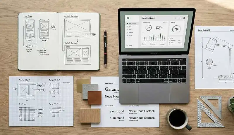
Prototyping is where the conversation between form and function becomes visible. Sketches, wireframes, mockups, and models allow designers to test ideas before investing too heavily in final outputs.
This stage is especially important when balancing visual identity with performance. A polished concept may look excellent on presentation slides but feel awkward in use. Prototypes expose these problems early.
In digital design, prototypes show whether navigation, button placement, and feedback states work smoothly. In product design, prototypes reveal weight, comfort, reach, and material behavior. Each round of testing sharpens both usefulness and appearance.
Build Cross-Disciplinary Collaboration
Design quality improves when multiple perspectives shape the result. Engineers understand feasibility. Marketers understand positioning. User researchers understand behavior. Designers bring these inputs into a coherent form.
When teams work in isolation, form and function often drift apart. A visually strong concept may be difficult to produce. A technically solid solution may lack emotional resonance. Collaboration reduces these gaps.
Strong outcomes often come from early conversations about trade-offs. Instead of asking whether style or function should win, teams should ask how each can improve the other.
Let Brand Guide, Not Dominate
Brand identity matters, but it should not overpower the user experience. A brand can influence tone, material, color, and expression, yet the design still needs to work on practical terms.
A good example is a luxury brand website. It may use generous spacing, elegant typography, and cinematic visuals, but if users cannot find product details or complete checkout smoothly, the brand experience weakens. Visual identity should elevate use, not interrupt it.
Common Challenges and How to Overcome Them
Too Many Features
Feature overload is one of the most common threats to balanced design. Teams often keep adding options in the hope of increasing value. The result is usually the opposite. More buttons, more screens, or more product elements can make the experience harder to understand and less attractive.
The fix is prioritization. Identify the essential jobs users need to complete. Support those first. Remove or hide secondary features unless they clearly improve the experience.
Style That Hides Function
Some designs look sophisticated because they reduce visible cues, flatten distinctions, or favor novelty over clarity. This can make the product harder to use. Hidden menus, low-contrast text, or unclear interactions may create a sleek aesthetic, but they often increase user effort.
The solution is not to reject style. It is to use style more responsibly. Make interactions visible. Preserve readability. Let elegance come from refinement, not obscurity.
Function That Ignores Emotional Appeal
On the other side, some designs become so focused on performance that they forget emotional value. They work, but they do not connect. Users may respect them without loving them.
This matters because preference is rarely based on function alone. People return to products that feel good to use and pleasant to own. They remember spaces that create atmosphere. They trust brands that express coherence and care.
The answer is to design beyond bare utility. Material choice, tone of voice, visual rhythm, and finishing details can all add character without reducing usability.
Constraints in Budget, Material, or Technology
Real projects involve limitations. Budgets shrink. Materials change. Technical systems impose restrictions. These conditions can make balance harder, but they can also sharpen thinking.
Constraints force designers to focus on what matters most. They encourage resourceful decisions. A limited palette can produce stronger visual consistency. A tight budget can push a team toward simpler, smarter solutions. Good design often emerges not from abundance, but from disciplined choices within boundaries.
Case Studies of Strong Design Balance
Minimalist Consumer Technology
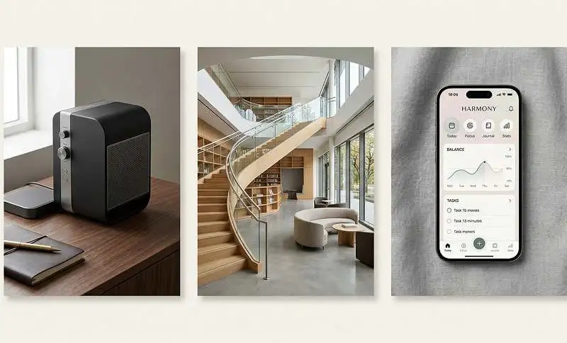
Many of the best consumer electronics products succeed because they reduce visible complexity while preserving powerful function. Clean surfaces, intuitive interfaces, and limited visual distraction help users feel in control. The style communicates confidence, while the function supports repeated use.
What makes these products effective is not minimalism alone. It is clarity. Every visual choice reinforces the product’s purpose.
Well-Designed Public Spaces
A successful public building balances movement, accessibility, identity, and atmosphere. Users need to understand where to go, how to move, and what the space is for. At the same time, the building should create a memorable impression.
When signage, lighting, materials, and circulation work together, the result feels effortless. The style is not applied on top. It grows from the way the building performs.
Thoughtful Digital Interfaces
The strongest digital interfaces often feel invisible in use. Users know where to click, what to expect, and how to recover from mistakes. Yet these interfaces also have personality. Their color systems, iconography, motion, and layout create a distinct brand presence.
This balance comes from respecting behavior. The design does not demand attention for its own sake. It earns attention by making tasks easier and more enjoyable.
Practical Tips for Designers Seeking Mastery
Audit Every Visual Choice
Ask a simple question: what is this element doing here? If it improves clarity, emotional tone, hierarchy, or usability, keep it. If not, reconsider it. This habit strengthens both aesthetics and function.
Test With Real Users
Do not rely only on internal opinion. Observe how people actually interact with your design. Where do they pause? What do they miss? What feels natural to them? User behavior is often more revealing than team discussion.
Protect the Core Experience
Identify the design moments that matter most. In an app, that might be onboarding, search, or checkout. In a product, it could be grip, durability, or setup. In a space, it may be entry, flow, or comfort. Make these moments excellent before refining secondary details.
Use Style to Clarify Meaning
Color, typography, spacing, and shape should not just make things attractive. They should also communicate. Use them to signal priority, interaction, tone, and identity.
Keep Refining
Balanced design rarely appears in the first draft. It takes iteration. Each revision should reduce tension between beauty and use. Over time, the design becomes more coherent, more useful, and more elegant.
Learn more about: What is Human Computer Interaction
Conclusion
Balancing form and function without compromising style is not about splitting the difference. It is about creating unity. The goal is not to make something partly beautiful and partly useful. The goal is to create something where beauty strengthens usability and usability strengthens beauty.
Designers achieve this by starting with purpose, understanding real users, simplifying where possible, structuring information clearly, and testing ideas before locking them in. They also know that style is not decoration. It is part of how people understand quality, trust, and meaning.
The strongest designs do not force a choice between performance and visual appeal. They prove that both can exist in the same solution when every decision is intentional. That is where real design mastery begins.