
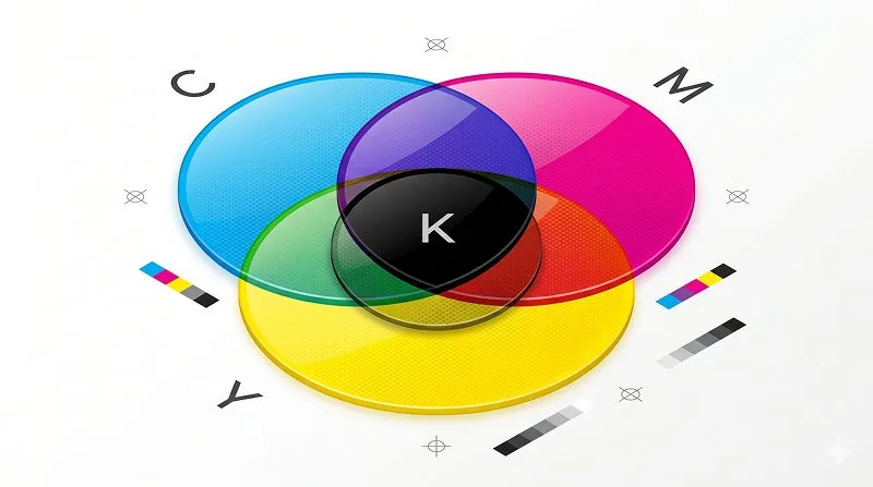
CMYK is a subtractive color model built on four inks — cyan, magenta, yellow, and black — that printers use to reproduce full-color images on paper and other physical media. When people talk about “cmyk cyan magenta” they are usually referring to how these two key inks interact to form most printable colors, especially blues, purples, and skin tones.
TL;DR (Quick Summary)
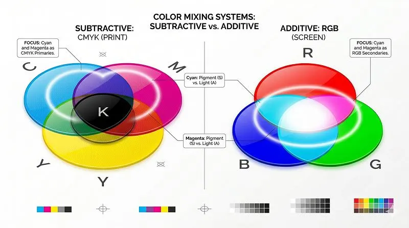
- CMYK is a subtractive color model used for printing; RGB is an additive model used for screens.
- Cyan and magenta are the backbone of many critical print colors, from deep blues to accurate skin tones.
- Printers build color with tiny dots of CMYK inks; changing dot size and density changes brightness, saturation, and smoothness.
- RGB files must be converted to CMYK before professional printing to avoid unexpected color shifts.
- Ink type (dye vs pigment, coated vs uncoated profiles) strongly affects how close your print will match what you see on screen.
Learn more about: Definition for Shape in Art
What Is the CMYK Color Model and Why Does It Use Cyan and Magenta?
CMYK as a subtractive color model
The CMYK color model stands for Cyan, Magenta, Yellow, and Key (Black) and is the global standard for full-color printing. It’s called a subtractive model because color appears by subtracting (absorbing) parts of white light instead of adding light like on a screen. In practice, you start with white paper, then add inks that absorb specific wavelengths so that the remaining light reflected back to your eye appears as a particular color.
Cyan ink absorbs most of the red part of the spectrum and lets green and blue bounce back, so we perceive it as a greenish-blue. Magenta absorbs green and lets red and blue reflect, which we see as a purplish-red. Yellow absorbs blue, reflecting red and green, which we read as yellow. When you overlay these inks in different proportions, you selectively remove parts of the spectrum and create a wide range of colors.
Black (“Key”) is added because, in theory, equal parts cyan, magenta, and yellow should produce a deep neutral black, but in reality you get a muddy dark brown. Black ink gives stronger contrast, sharper text, and more economical printing. According to industry standards (like ISO 12647), using a dedicated black channel also improves consistency across print runs.
Why cyan and magenta are so critical in CMYK
Cyan and magenta are not arbitrary choices; they’re complementary to red and green in the light (RGB) world. When you combine cyan and magenta in print, you’re largely controlling the blue–violet region of the spectrum. This is crucial because many visually important colors — corporate blues, deep purples, even parts of neutral shadows — rely on precise interaction between these two inks.
In real print jobs, I often see that if cyan is slightly too strong or magenta too weak, brand blues shift toward teal, and skin tones can look sickly or cold. That’s why professional print workflows pay close attention to the cyan–magenta balance in profiles and separations. The exact combination of all four inks determines the final perceived color, but cyan and magenta often drive the “character” of the image.
How Does CMYK Actually Work in Printing Processes?
From digital file to halftone dots
In printing, the CMYK model works by breaking your image into four separate plates or passes — one each for cyan, magenta, yellow, and black. The RIP (Raster Image Processor) converts continuous-tone images into halftone dots: tiny dots of each ink with varying size and spacing. To the naked eye at normal viewing distance, these dots blend into smooth tones.
Each color channel is printed as a screen of dots at a specific angle (for example, 15°, 45°, 75°, 0°) to reduce visible patterns and moiré. Where you want more of a particular color, the dots for that ink are larger or closer together (higher coverage). Where you want less, they are smaller or more sparse. The overlay of four dot patterns creates the perception of millions of colors, even though the printer only uses four inks.
In practice, if you look at a printed magazine through a loupe, you’ll see distinct cyan, magenta, yellow, and black dots. A bright green area will show mostly yellow and cyan dots; a deep purple will be primarily magenta and cyan; warm shadows will mix all four with more black for depth and ink economy.
Controlling brightness, smoothness, and accuracy
Brightness (lightness/darkness) in CMYK is mainly controlled by total ink coverage and dot size. Larger or denser dots mean less white paper showing through, so the area looks darker and richer. Smaller or sparser dots let more paper show, making the area lighter. For smooth gradients and skin tones, printers use higher line screens (more dots per inch) to avoid visible stepping.
Color accuracy depends on several parameters:
- Dot size and shape: Round vs elliptical dots handle midtones and shadows differently.
- Screen frequency: Higher line screens (e.g., 175–200 lpi for quality magazines) give finer detail but demand better paper and press control.
- Registration: Misalignment between cyan, magenta, yellow, and black dots causes color fringes and blur.
When set up correctly, CMYK printing can reproduce a wide gamut of colors reliably across different presses and substrates. However, its gamut is still smaller than RGB, which is why some neon or super-saturated screen colors cannot be matched exactly in print.
Why Choose CMYK for Print Instead of RGB?
CMYK is optimized for ink on paper
CMYK is used for printing because it models how ink interacts with real materials, while RGB models how light is emitted from screens. When you print, you are always starting from a white (or off-white) base and adding inks that absorb light. The CMYK model directly maps to this subtractive reality, so it is more predictable and controllable on press.
In contrast, RGB assumes a black starting point (no light) and adds red, green, and blue light to build color. This is perfect for monitors, phones, and TVs but doesn’t reflect how physical inks behave. If you send an RGB file directly to a CMYK press without proper conversion, you’ll often get duller blues, flatter greens, and unexpected shifts in saturated areas.
From experience handling brand guidelines, I’ve seen many cases where corporate blues designed purely in RGB ended up looking too purple or too muted in print. Working in CMYK (or at least soft-proofing in a CMYK profile) helps you design within the realistic printable gamut, avoiding expensive reprints.
Advantages of CMYK in professional workflows
Professional printing relies on CMYK because it offers:
1. Color accuracy for physical output
CMYK profiles (like FOGRA, SWOP, GRACoL) are calibrated to specific presses, papers, and inks. This allows color management systems to predict, fairly precisely, how your file will look when printed.
2. Consistency across production runs
Once you lock in CMYK values for a brand color, printers can measure and maintain those values with densitometers and spectrophotometers. According to industry practice, variations are kept within tight tolerances (often ΔE < 3–5), so your brochures and packaging look the same across batches.
3. Industry standard and broad support
All major page layout and design tools (InDesign, Illustrator, Photoshop) support CMYK workflows, spot colors, and print profiles. Commercial printers expect CMYK-ready files and build their quality control around them.
For real-world uses like packaging, catalogs, signage, and marketing materials, understanding CMYK lets you specify colors that survive the journey from screen to paper with fewer surprises.
CMYK vs RGB: How Are They Different and When Should You Use Each?
RGB as an additive light-based model
RGB (Red, Green, Blue) is an additive color model used for devices that emit light — monitors, TVs, projectors, and phone screens. You start from black (no light) and add colored light: red, green, and blue. At full intensity, all three combined produce white; at zero intensity, you get black. Intermediate combinations yield the full spectrum of colors you see on screen.
When you mix red and green light at equal intensities, you perceive yellow. Green and blue produce cyan; blue and red produce magenta. Because light sources can be very intense, RGB can display very bright, saturated colors that CMYK cannot reproduce, especially in neon greens, electric blues, and very vivid reds.
All these adjustments happen digitally: the device controls the strength (0–255 in 8-bit systems) of each channel per pixel. Calibration tools and color profiles (like sRGB, Adobe RGB) define how these numbers map to actual colors.
Key differences in perception and workflow
The biggest practical difference between RGB and CMYK is how colors look and behave between screen and print:
- Brightness and saturation: Colors on screen often appear more luminous because you are looking at light directly. The same color converted to CMYK will look more subdued, as it depends on reflected light from paper.
- Gamut: RGB has a larger color gamut than CMYK. Some RGB colors are literally impossible to match in standard four-color printing.
- Conversion: When you convert RGB to CMYK, the software remaps colors to the closest printable equivalents. Without soft-proofing, this can cause surprises, especially in logos and product photos.
Best practice in the industry is:
- Design for web and screen in RGB, export to formats like PNG, JPEG, or SVG.
- Design for print in CMYK (or at least check CMYK previews), and export press-ready PDFs with embedded CMYK profiles.
If a project needs both (e.g., a campaign that goes online and to print), start in RGB for flexibility, then create a CMYK-optimized version and manually tweak critical colors after conversion. This is particularly important where cmyk cyan magenta combinations define key brand blues or purples.
What Types of Inks and Papers Affect CMYK Cyan and Magenta Behavior?
Main ink types: dye-based vs pigment-based
In practice, the way cyan and magenta behave in CMYK printing depends heavily on ink chemistry and substrate. Two major categories you’ll encounter are:
1. Dye-based inks
These use colorants that are fully dissolved in a liquid carrier. They are common in desktop inkjet printers and some photo printers.
- Pros: Very bright, saturated colors; smooth gradients; good for photos and short-term displays.
- Cons: Less resistant to UV light and water; can fade faster; can bleed more on absorbent paper.
- Best for: Home/office printing, quick proofs, indoor posters not meant to last for years.
2. Pigment-based inks
These use tiny solid pigment particles suspended in a carrier. They are standard in many professional inkjet systems and fine art printing.
- Pros: Much better lightfastness; more resistant to fading and water; more stable over time.
- Cons: Sometimes slightly less saturated; can require specific coated media for best results; typically more expensive.
- Best for: Archival prints, fine art, professional photography, long-lived signage.
In offset and packaging printing, cyan and magenta are typically pigment-based process inks formulated to ISO or G7 targets. There, the exact pigment formulation strongly affects how blues, purples, and skin tones render, which is why press profiles are so important.
Paper and coating: how substrate changes everything
Paper (or other substrates) is the second major sub-component that shapes CMYK output:
- Coated paper (gloss, silk, matte)
Has a smooth, sealed surface that keeps ink more on top.
- Results: Sharper dots, higher color density, more vibrant cyan and magenta.
- Typical use: Magazines, brochures, high-end catalogs, art books.
- Uncoated paper (offset, bond, recycled)
More porous, absorbs ink into fibers.
- Results: Softer edges, lower saturation, slightly duller colors, especially in blue–purple ranges.
- Typical use: Books, stationery, forms, eco-focused materials.
- Specialty media (synthetics, films, packaging board)
Can be engineered for very high density and durability.
- Results: Strong, punchy colors; specific behavior depends on coating and ink system.
- Typical use: Labels, outdoor signage, packaging.
Based on experience preparing print runs, one common mistake is approving color on a home inkjet proof (often dye inks on uncoated paper) and expecting the same look on a coated offset stock. Cyan and magenta, in particular, can look significantly more vivid on coated papers and more muted on uncoated. You should always proof on media and with a process that closely matches the final production.
Learn more about: Voice User Interface Design
Conclusion: How to Use CMYK Cyan Magenta Effectively in Real Projects
CMYK is the most accurate model for predicting how color will look when printed, and understanding how cyan and magenta interact is crucial for controlling blues, purples, and many skin tones. Compared with RGB, CMYK is less flashy but far more honest about what ink on paper can actually do, which is why it remains the print industry standard.
To use cmyk cyan magenta effectively in your projects:
- Design with the final medium in mind: Work in CMYK (or at least soft-proof) for anything destined for print.
- Watch critical hues: Pay extra attention to brand blues, purples, and complex skin tones where cyan–magenta balance is delicate.
- Match ink and paper to your goals: Choose dye vs pigment and coated vs uncoated stock based on required vibrancy, durability, and budget.
- Proof realistically: Review hard proofs made with similar inks and substrates to your final job, not just what you see on screen.
By combining a basic understanding of the CMYK model with practical choices about inks, papers, and workflows, you can greatly reduce color surprises and produce printed materials that look intentional, consistent, and professional.