
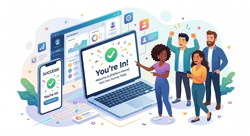
A user registration success message is the confirmation text a person sees right after they finish creating an account, and it quietly decides whether they feel confident enough to keep going. In practice, this tiny piece of microcopy can either keep momentum high or leave new users wondering if something broke and if they should try again.
Learn more about: How to Classify Software Applications Components
TL;DR:
- Always confirm clearly that the account was created and what will happen next.
- Separate “registration complete” from “please verify your email” so users are not confused.
- Use this message to highlight one simple next step, not five competing options.
- Match the tone to your brand (friendly, formal, quirky) but never sacrifice clarity.
- Test different versions; small tweaks here often move activation and retention numbers.
What Is a User Registration Success Message (And Why Does It Matter)?
A user registration success message is the on-screen or in-channel confirmation that tells someone their signup worked and that they now have an account. You’ll typically show it on a dedicated success screen, a modal, a toast notification, or in a follow-up email or push notification right after registration completes. Based on experience working with SaaS products, this is one of the highest-attention moments you will ever get from a new user.
This message is not the same as an email verification prompt or a generic welcome message, even though they sometimes appear together. The success copy answers the question “Did this work?” while verification answers “What do I need to do to fully activate?” and a welcome message focuses on value and orientation. When you blur these together, people miss critical steps or feel overwhelmed.
According to multiple onboarding benchmarks, the first post-signup touchpoint often sees engagement rates 2–3x higher than later lifecycle messages. That means the words you place on this confirmation screen or first email directly influence activation, feature adoption, and even long-term retention. A vague “Success!” with no guidance wastes that attention and sends new users off to guess what they should do next.
How Is It Different From Other Post-Signup Messages?
A registration confirmation is different because its core job is to close the loop on the action the user just took. In practice, it should answer three things fast: what just happened, what’s happening behind the scenes, and what they should do now. Anything that does not serve those three goals is optional.
Verification messages, password setup prompts, and full onboarding tours all play supporting roles but at different stages. For example, a banking app might show “Account created” on-screen, then send a separate secure email to verify identity and a later message to explain features. According to experts in UX writing, separating these reduces cognitive load and support tickets.
When teams skip this distinction, users often think registration failed because they are waiting for an email that never comes or they misread a verification request as an error. I have seen support teams flooded with “Did my account get created?” tickets simply because the success copy never explicitly said “Your account is ready.”
What Makes a Good User Registration Success Message?
A strong success message clearly confirms the action, reduces anxiety, and directs users to one focused next step that moves them closer to value. The best ones are short but specific: they state that the account exists, mention any immediate constraints (like needing email verification), and provide a single primary button or action. In practice, this small clarity boost can raise activation rates without changing any design.
By contrast, a weak message is generic, ambiguous, or silent about what happens next. “Success!” alone forces people to guess whether they can log in, whether they should check their email, or whether something else is required. Industry standards in onboarding design emphasize that uncertainty at this stage often leads to drop-off, especially on mobile where switching apps to check email is already a friction point.
It’s also worth noting that tone matters, but it comes after clarity. According to research on trust in digital products, users judge reliability in milliseconds based on feedback messages and visual cues. Friendly or quirky language can create delight, but only if it rides on top of accurate, concrete information about status and next steps.
How Should You Structure This Message?
The most reliable structure is:
- Clear confirmation line (what just happened).
- Short explanation or expectation (what’s happening now or next).
- One primary call to action (what to do now).
In practice, this might look like: headline on the screen, supporting sentence or two, and one main button or link. Email versions follow the same pattern in subject line, preheader, and top-of-email copy.
This structure works across web apps, mobile apps, and email because it mirrors how people scan: they look for a status signal first, then context, then an action. According to usability tests I’ve run, screens that respect this pattern reduce time-to-first-action and lower the rate of “back” button taps after signup.
What Are Some Effective Registration Success Message Examples?
Below are grouped examples you can adapt. Each one confirms the action, sets expectations, and suggests a next step, with tone tailored to different brands. In practice, most teams will pick one category that matches their voice, then tweak wording to fit their product and audience.
Use these as templates, not scripts; swap in your product name, key feature, or primary activation step. Also, keep in mind that you can pair on-screen confirmation with an email or push notification that reinforces the same core message. Consistency across channels increases trust and reduces confusion.
General Registration Success Message Examples
Best for: Any product that needs straightforward, versatile confirmation copy.
- “You’re all set—your account has been created. Log in now to start exploring your dashboard.”
- “Registration complete. We’ve saved your details and you can sign in anytime with your email and password.”
- “Your account is ready to go. Next, log in to personalize your settings.”
- “Signup successful. Check your inbox for a welcome email and then continue to your account.”
- “You’re in. Use your new account to track activity, manage preferences, and more.”
Friendly/Playful Messages
Best for: Casual, approachable brands that want to feel human and fun.
- “You did it! Your new account is officially alive. Let’s log in and make it feel like home.”
- “High five—registration was a success. Jump into your account and poke around.”
- “Welcome to the crew! Your account’s ready; sign in to see what you just unlocked.”
- “All set, superstar. Log in now and we’ll show you around.”
- “Boom! You’re registered. Head to your dashboard and start exploring.”
Professional/Corporate Messages
Best for: Financial services, B2B SaaS, healthcare, or any brand that needs a formal tone.
- “Your account has been successfully created. Please sign in to access your dashboard and available services.”
- “Registration completed. We’ve sent a confirmation email with additional details about your new account.”
- “Thank you for registering. You may now log in to review your profile and security settings.”
- “Your new account is active. Continue to the portal to manage your information and requests.”
- “Account setup is complete. For your security, please verify your email before accessing all features.”
Learn more about: The Twelve-Factor App Config Environment variables
How Should You Tailor Messages for Different Use Cases?
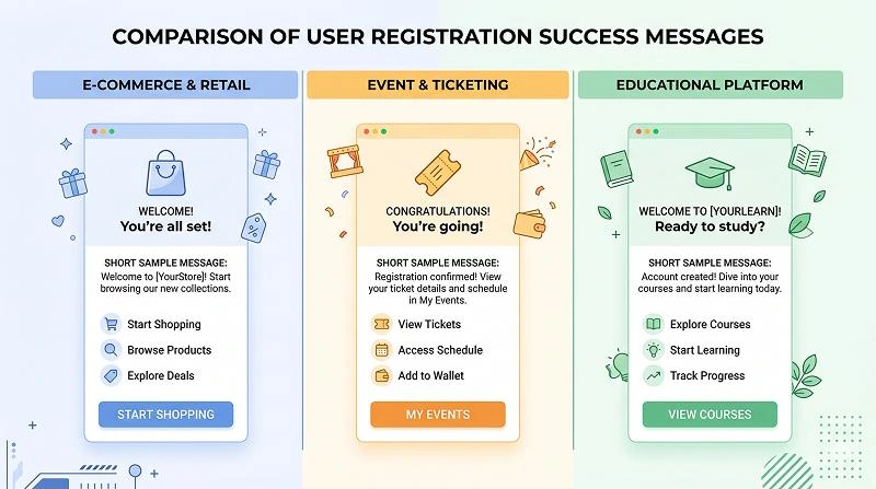
Different industries and product types need slightly different emphasis in this moment, even though the core pattern stays the same. In e-commerce, you might highlight faster checkout; in events, you emphasize tickets and dates; in education, you focus on the first learning action. Based on experience, tailoring the benefit in the success copy often nudges users toward the behaviors that correlate with long-term retention.
When you write for specific use cases, keep the confirmation line consistent but swap out the benefit and next step to match the context. For example, a marketplace might push users to complete their profile, while a fitness app nudges them to set their first goal. According to product analytics best practices, tying this step to your primary activation metric is one of the simplest growth wins you can implement.
E‑Commerce & Retail Registration Messages
- “Account created. Next time you shop, just log in for faster checkout and order tracking.”
- “You’re registered. Sign in now to save your address, view past orders, and manage returns.”
- “Welcome! Your store account is ready—log in to add items to your wishlist and save your cart.”
- “Signup successful. We’ve applied your new member profile, so log in to see personalized offers.”
- “Your retail account is good to go. Head to your profile to add shipping details and payment methods.”
Event & Ticketing Messages
- “You’re in! Your account is ready—log in to view your upcoming events and tickets.”
- “Registration complete. Sign in to confirm your seat and add events to your calendar.”
- “Your event profile has been created. Next, log in to finish your attendee details.”
- “Success. Use your new account to track tickets, manage guests, and get event reminders.”
- “Account ready. Log in now so you don’t miss schedule changes or venue updates.”
Educational & Learning Platform Messages
- “Welcome to your new learning space. Log in to start your first lesson.”
- “Account created. Continue to your dashboard to choose a course and set your study goal.”
- “You’re all set to learn. Sign in to take your placement quiz and get a personalized path.”
- “Registration successful. Head to your classroom to see today’s recommended activities.”
- “Your student account is active. Log in to explore courses, track progress, and earn certificates.”
How Can You Make These Messages Drive Real Activation?
To turn a simple confirmation into an activation driver, tie the next step in your copy to the action most predictive of long-term engagement. In practice, that might be “connect your data source,” “invite a teammate,” or “create your first project.” According to experts in product-led growth, optimizing this first post-signup step can move activation rates more than adding extra features.
You should also align your on-screen success message with your immediate follow-up email or push notification. The on-screen text can say “Account created—check your email to verify,” while the email subject reinforces “Verify your new account to start using [Product].” Consistency reduces confusion and ensures users know exactly why they are seeing each message.
Inspirational Messages
Best for: Coaching, wellness, productivity, and education brands that want to motivate action.
- “You just took the first step toward your goal. Log in now to set your first milestone.”
- “Your account is ready—let’s turn your plans into progress. Sign in to get started.”
- “Registration complete. Today is the perfect day to begin; head to your dashboard and take your first action.”
- “You’re in. Log in to create a routine you can actually stick with.”
- “Your new account is live. Start now, even if it’s just one small step.”
Fun/Quirky Messages
Best for: Creative apps, consumer products, or brands with a bold, playful personality.
- “We rolled out the red carpet—your account just arrived. Log in and take it for a spin.”
- “Registration: nailed it. Now let’s make this place yours.”
- “Your account is cooked to perfection. Sign in while it’s still hot.”
- “You’re officially part of the club. Head inside and see what’s behind the curtain.”
- “All systems go. Log in and press all the buttons (responsibly).”
What Are Common Mistakes to Avoid (And What Should You Do Next)?
The most common mistakes with this moment are being too generic, skipping the next step, and mixing confirmation with error or verification language. “Success” without context, or “Check your email” without saying why, leaves users uncertain and increases support requests. In practice, any wording that makes people wonder “Did this actually work?” is a sign your copy needs revision.
Another frequent issue is overloading the screen with multiple CTAs: “Go to dashboard,” “Invite friends,” “Watch a tour,” and “Upgrade now” all at once. Industry standards in UX suggest keeping one primary action and, at most, one subtle secondary option. Worth noting: you can still introduce those other actions later in onboarding emails, tooltips, or empty states.
How to Implement and Test Strong Success Messages
- Start with a simple template: confirmation line, expectation line, one clear CTA.
- Map your primary activation step and make that the main next action in the copy.
- Keep tone on-brand, but always prioritize clarity over cleverness.
- A/B test variants that change the next step, not just the adjectives, to see impact on activation.
- Review analytics and support tickets regularly; if people ask “Did my registration work?” your message is failing.
A well-crafted user registration success message closes the loop on a critical action, builds trust, and nudges new users toward their first real win with your product. When you combine clear confirmation, a concrete next step, and consistent brand voice, you turn a forgettable screen into a quiet but powerful growth lever.
Learn more about: Inject Environment Variables to The Build Process