
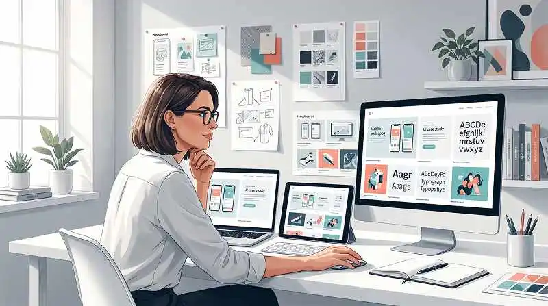
A design portfolio is a focused collection of your best work that makes the right people want to talk to you. When people search for the best tips for design portfolios, what they actually need is a practical strategy that matches how hiring managers really review portfolios in the wild.
I’ve been hiring designers (product, UX, visual, brand) for over 12 years, and I’ve reviewed well over a thousand portfolios. A big chunk of them were… not great. That’s rarely because the designer is bad. It’s usually because there’s a lot of confusing, outdated, or flat‑out terrible advice about portfolios floating around, plus shiny Dribbble shots that teach the wrong lessons.
TL;DR – The 10 Best Tips for Design Portfolios
- Treat your portfolio as a tool to start conversations, not a museum of everything you’ve ever done.
- Create two versions: a short, scannable online one and a deeper “walkthrough” version for interviews.
- Keep the structure dead simple: clear homepage, 3–5 case studies, about, resume, contact.
- Lead with outcomes and your role; support with process, not the other way around.
- Respect time: 30 seconds on your homepage, 5 minutes per portfolio, tops. Design for that reality.
Learn more about: Gestalt Principle of Continuity
What fundamental things do you need to understand before building a portfolio?
1. The real purpose of your portfolio
The real purpose of your portfolio is to get you into a conversation with a hiring manager, not to “prove” everything about your career. In practice, that means your job is to reduce doubt: “Can this person probably do the job?” If the answer feels like a likely yes, you get an interview. That’s it.
Based on experience, portfolios that try to tell the entire story of every project backfire. No one is reading 5,000 words per case study at the screening stage. Industry best practice is to show just enough: the problem, your role, a few smart decisions, and the impact. Think of it as a teaser trailer, not a 10‑episode documentary.
So when you look for the best tips for design portfolios, filter them through this lens: “Does this help someone quickly see that I can solve their kind of problems?” If not, it’s decoration. Nice, but not helping you get hired.
2. You need two different versions, not one
You need two different portfolios because people consume them in totally different contexts. The online version is for fast scanning on a laptop at 11 p.m. The presentation version is for a live walkthrough where you’re talking over slides or screens.
The online portfolio should be:
- Short, visual, and skimmable
- Structured for 30‑second and 5‑minute passes
- Focused on headlines, summaries, and outcomes
The presentation portfolio can be:
- More detailed on process and decisions
- Rich with intermediate artifacts (flows, sketches, tests)
- Designed to support a 20–40 minute story with you talking
Perlu diperhatikan: trying to make one portfolio do both jobs usually means it does neither well. Keep the online version lean; save the deep dives for when you actually have someone’s attention in a meeting.
3. How hiring managers really review portfolios
Hiring managers (and often senior designers) review portfolios in batches. I’ve often looked at 10–20 portfolios in one sitting. Realistically, you get about 30 seconds on your landing page to earn another 4–5 minutes on your case studies.
In that 30 seconds, I’m asking:
- What kind of designer is this?
- What level/seniority roughly?
- Do they work on problems similar to ours?
- Is anything here clearly broken (no structure, unclear role, pure visuals with no context)?
This is why long walls of text, slow animations, or confusing navigation kill you. No one “figures out” a portfolio in that context. According to most UX hiring managers I’ve talked to, clarity beats cleverness almost every time. Design assuming the reviewer is tired, busy, and has Slack pinging nonstop—because they are.
What are the main portfolio styles and which one should you choose?
Professional vs experimental: two big approaches
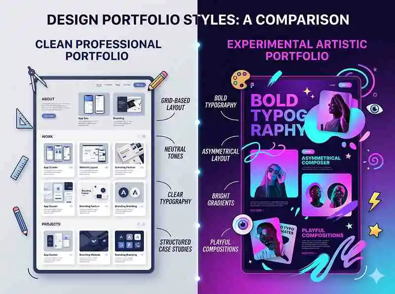
Most online portfolios fall into two broad styles: professional and experimental. Both can work, but they come with different risks and rewards.
A professional portfolio is:
- Clean, simple, and easy to navigate
- Using a standard layout (grid of projects, clear headings)
- Lightly branded with your personality, but not screaming for attention
An experimental portfolio is:
- Highly custom layout or interaction
- Heavy motion, unusual navigation, or narrative formats
- Sometimes blurs the line between portfolio and art piece
From what I’ve seen, professional is the safest default, especially if you’re applying for product/UX roles or agencies that care about usability. Experimental can be powerful if you’re in motion, creative tech, or art‑direction‑heavy roles—but only if it’s still usable and fast.
When does an experimental portfolio make sense?
An experimental portfolio makes sense when:
- Your target roles value creative risk and visual innovation
- You’re confident in your front‑end or interaction skills
- You’re okay with some people bouncing because they “don’t get it”
For example, for a creative technologist or motion designer, a bold, animated experience can instantly show your craft. But even then, the same constraints apply: clear labeling of projects, fast load times, obvious contact details. Wild visuals on top of bad information architecture is just chaos.
If you’re not sure, go with a professional structure and add personality through:
- Strong typography and color choices
- Well‑written microcopy and headlines
- Thoughtful project thumbnails and hero images
That way you still stand out without gambling the entire experience.
How to stand out without being “weird for the sake of it”
You don’t need a bizarre navigation pattern to be memorable. In practice, portfolios stand out for three reasons:
- Clear positioning (“Senior Product Designer focused on complex B2B tools”)
- Strong, relevant case studies with real impact
- Crisp storytelling and writing
A simple site with:
- A sharp one‑line intro
- Three strong case studies tailored to the role
- Honest reflection on what worked and what didn’t
…will beat a flashy but confusing site almost every time. Many of the best tips for design portfolios boil down to this: be clear, be specific, and let your work do the talking.
Learn more about: What Can I do With a Design System Json File
How should you structure the content and navigation of your portfolio?
The essential information architecture
A solid portfolio has very simple information architecture. You don’t get extra points for complex menus. At minimum, you need:
- Home / Landing page
- Projects / Case Studies (3–6 total)
- About
- Resume / Experience (can be a section or PDF link)
- Contact
This can live on one long page or across several pages, as long as everything is easy to find. Industry standards lean toward a homepage + separate project pages, because it keeps each case study focused and shareable.
Make sure your main navigation is:
- Always visible (top or side)
- Using obvious labels (“Work”, “Projects”, “About”, “Contact”)
- Consistent across desktop and mobile
Remember: the goal is to help a tired reviewer answer, “Where should I click next?” without thinking.
What absolutely must be easy to find?
There are five things I should never have to hunt for:
- What you do (your role and focus)
- Where you’ve worked or what kind of clients you’ve had
- 3–5 representative projects
- Where you are / time zone (or at least region)
- How to contact you
Hide any of these and you’re making the reviewer work for basic facts. According to most hiring workflows, if I can’t answer those questions in under a minute, I’ll just move on to the next candidate. That’s harsh, but it’s the reality of batch reviewing.
Where should visuals and media go?
Use visuals to support scanning, not to overwhelm. Good places for images and media:
- Project thumbnails on the homepage (1 key image per case study)
- A hero image at the top of each case study that shows the final product
- 3–8 supporting images inside each case study (flows, screens, prototypes)
- Optional: short GIFs or 10–30 second videos for interactions
Avoid:
- Autoplay audio or full‑screen intro videos
- Huge uncompressed images that slow everything down
- Endless galleries without captions or context
Each visual should answer: “What is this, and why does it matter for this project?” A short caption is often all it takes.
How do you design each key section so it actually gets read?
The home screen: your 30‑second pitch
The home screen’s job is to confirm that I’m in the right place and give me a reason to click a project. The top of the page should instantly show your name, role, and a focused positioning statement.
Bad example:
“Hi, I’m Alex and I love solving problems at the intersection of humans and technology.”
Better example:
“Alex Lee — Senior Product Designer focused on complex B2B dashboards and workflows.”
In practice, the top of your homepage should include:
- Your name and role
- A one‑sentence focus or niche
- 3–6 project cards with clear titles and short descriptions
- A visible link to “About” and “Contact”
Avoid long life stories on the landing page. If I’m interested, I’ll click “About.” Your homepage is a signpost, not a memoir.
Case studies: what goes at the top?
The top of each case study should answer the key questions fast. A simple header block can include:
- Project name
- Company / client (or “Personal project”)
- Your role
- Duration (e.g., “3 months”)
- Team (e.g., “1 PM, 2 engineers, me as sole designer”)
- One‑sentence problem statement
- One‑sentence outcome
Bad example:
“This was a really interesting project where I learned a lot about users and iterated many times.”
Better example:
“Redesigned the onboarding for X SaaS tool to reduce setup time for new admins. Result: 18% increase in completed setups and 12% drop in support tickets within 3 months.”
This “at‑a‑glance” block lets a reviewer decide in 10 seconds whether this project is relevant. Then they can scroll for more detail if they care.
About, resume, and contact: what really matters?
The About page’s job is to make you feel like a real, hireable human. Focus on:
- What you do now
- What types of problems you like solving
- A bit of background (industry, domains, tools)
- Maybe 1–2 personal details to show personality
Bad example:
“I’ve always been passionate about design since I was a child drawing things.”
Better example:
“I’m a product designer with 6+ years in fintech and B2B SaaS, currently focused on complex internal tools. I enjoy messy problem spaces, aligning stakeholders, and making ‘impossible’ workflows feel simple.”
Your resume can be:
- A concise section on the site
- A downloadable PDF
- Or both, as long as it’s up to date
Your contact section should be dead simple: email, LinkedIn, maybe Behance/Dribbble. No contact forms that break, no hiding your email behind clever interactions.
How do you structure strong case studies and respect the reviewer’s time?
A simple story structure that works every time
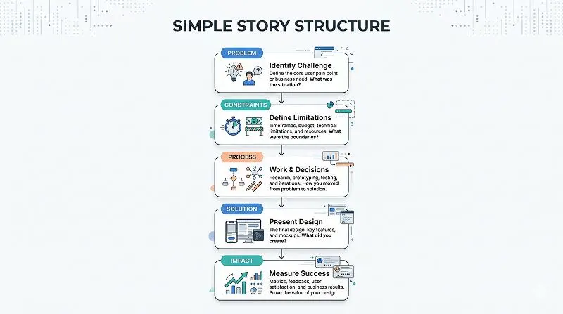
A reliable structure for each case study is:
1. Context & Problem
- Who is this for? What’s the product?
- What was broken or needed?
2. Constraints & Role
- Timeline, resources, limitations
- What you were responsible for
3. Process (highlight reel, not every detail)
- Key research or discovery
- A few important decisions and trade‑offs
- How you collaborated with others
4. Outcome & Impact
- What shipped or changed
- Metrics, qualitative feedback, or business impact
- If impact is unknown, what you expect and why
5. Reflection
- What you’d improve next time
- What you learned
You don’t need to show every wireframe. Show the 5–10 artifacts that best illustrate your thinking. According to most design leads I know, the clarity of your decisions matters more than the number of screens.
How long should each case study be?
For the online portfolio, aim for:
- Approx. 500–800 words per major case study
- 3–8 images with captions
- Clear headings and short paragraphs
No one wants to scroll through a novel. Remember: the screening pass is often 5 minutes total for your entire site. Use:
- Section headings (“Problem”, “Approach”, “Outcome”)
- Bullet points for key insights or results
- Bold text sparingly for important numbers or phrases
You can keep a longer “presentation” version (slides or Notion doc) for interviews where people explicitly ask for more depth.
How honest should you be about imperfect outcomes?
You should be honest, as long as you show reflection and learning. Real projects are messy. Metrics aren’t always perfect. Releases get cut.
Bad example:
“The project didn’t launch, but it was still a great learning experience.”
Better example:
“The project was deprioritized before launch due to a company pivot. However, our usability tests showed a 40% reduction in time‑to‑task for key flows. If revisiting this, I’d push harder for a small pilot release to validate in‑market.”
Most experienced hiring managers know that perfect outcomes are rare. What they’re looking for is ownership, critical thinking, and the ability to talk about trade‑offs without blaming everyone else.
Learn More about: Bottom Navigation Bar Design Mistakes Mobile App UX
Conclusion: what should you do next to improve your portfolio?
The core goal of your portfolio is simple: make the right people want to talk to you. All the best tips for design portfolios point back to that—clarity of role, relevant projects, and a structure that respects limited attention.
If you want an actionable next step, do this in the next week:
- Rewrite your homepage hero to clearly state your role and focus.
- Pick 3–5 projects and cut them down into the context → process → outcome → reflection structure.
- Add a simple header block to each case study with role, duration, team, problem, and impact.
- Remove at least 30% of the text that doesn’t help someone quickly see how you think and what you delivered.
You’re not trying to tell your whole life story. You’re trying to earn a conversation. Once you’re in the room (or on the call), then you can nerd out about every sticky note and every usability test.