

A bottom navigation bar looks simple, but bottom navigation bar design mistakes mobile app ux teams make here can quietly destroy usability, discovery, and retention. In practice, most navigation issues I see in audits come not from “big” flows, but from small, repeated frictions in the bottom bar: unclear labels, too many items, or awkward reach on large screens.
In a crowded app ecosystem where users uninstall within minutes if they feel lost, navigation is no longer a “visual” decision — it’s a product strategy decision. Poorly designed bottom bars lead to higher cognitive load, more mis-taps, and users failing to find core features you invested months building. On modern 6–7 inch phones, that pain is amplified when the bar fights human ergonomics.
This guide breaks down the 10 most common mistakes we make as designers when crafting bottom navigation, why they hurt, and how to fix them. You’ll see patterns from real projects, ergonomic principles like thumb zones, and concrete recommendations you can apply on your next release.
TL;DR — The 10 biggest bottom nav mistakes
- Cramming too many destinations into a single bar.
- Using ambiguous icons and missing or inconsistent labels.
- Breaking platform conventions and user mental models.
- Ignoring thumb reach and one‑handed ergonomics.
- Mixing hierarchy levels and stuffing secondary actions into the bar.
- Hiding core navigation behind floating buttons or gestures.
- Overusing animations and microinteractions that slow users down.
- Inconsistent states, feedback, and deep-link behavior.
- Neglecting accessibility: tap targets, contrast, and screen readers.
- Treating the bottom bar as static instead of evolving it with data.
Learn more about: Gestalt Principle of Continuity
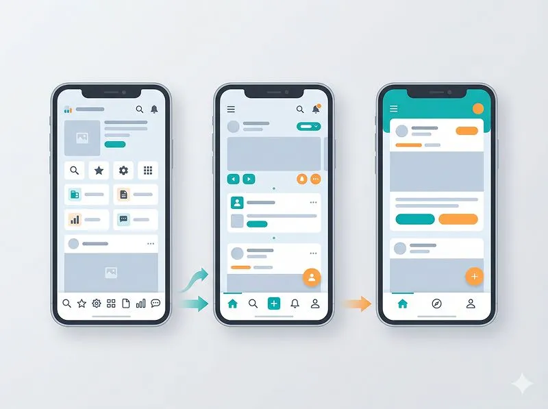
1. Are you overloading the bottom bar with too many items?
1.1 Why “just one more tab” quietly kills clarity
Overloading the bar with 5–7 items is one of the most common bottom navigation bar design mistakes in mobile app UX, especially in feature-rich products. On paper, adding one more tab feels harmless; in usability testing, it almost always dilutes focus and slows decision-making. Users need to scan more options, labels must be shorter, and icons become less distinguishable.
According to multiple UX studies, choice overload can increase decision time by 20–30% even when the options are familiar. In navigation, that delay shows up as micro-hesitation every time a user wants to move around. In my own audits of banking and e‑commerce apps, I often see “Deals”, “Discover”, “Explore”, and “More” living together — all competing for attention and none truly clear.
As designers, our job is to define a sharp information architecture, not to mirror the org chart in the nav. If everything is “top level”, nothing really is. The bottom bar should expose 3–5 truly primary destinations that matter for 80% of user sessions, not every stakeholder’s favorite feature.
1.2 How many items is actually ideal?
From experience and platform guidelines, the practical sweet spot is:
- 3–5 items total in most apps.
- 3–4 items for content‑heavy apps where labels must be clear.
- 5 items only when each destination is truly distinct and frequently used.
Android’s Material guidelines recommend 3–5 items; Apple’s Human Interface Guidelines also implicitly steer toward a small set of tabs. Once you cross 5, you often end up shrinking icons, truncating labels, or using cryptic abbreviations — all of which hurt scanability and comprehension.
If stakeholders push for more items, it’s usually a sign that:
- You need clearer hierarchy (what is truly primary vs secondary).
- Some sections can live inside others as sub‑tabs or filters.
- You haven’t agreed on the app’s core jobs‑to‑be‑done.
1.3 Fix: Prioritize ruthlessly and move the rest
In practice, the most effective fixes are:
- Run a card sorting / tree test to identify users’ mental grouping of sections.
- Limit the bar to 3–5 top‑level tasks (e.g., Home, Search, Activity, Profile).
- Move secondary features into:
– In‑screen menus or segmented controls.
– Contextual actions (e.g., inline filters, FAB for “create”).
– A dedicated “More” or “Menu” section, if truly needed.
A useful rule: if a destination is not used in at least 30–40% of typical sessions, it probably doesn’t belong in the bottom bar.
2. Are your icons and labels actually understandable?
2.1 The danger of icon‑only navigation
Another critical bottom navigation bar design mistake in mobile app UX is relying on icon‑only tabs without clear text labels. Designers often love minimalism; users pay the price with guesswork. In testing, I’ve seen users misinterpret “wallet” icons as “settings”, or “chart” icons as “history” or “analytics” depending on their background.
Behavioral psychology tells us that recognition beats recall: users perform better when they can recognize a label than when they must recall what an icon might mean. Luke Wroblewski’s “Obvious always wins” applies strongly here — if users hesitate, the icon has already failed.
Platform guidelines are explicit: both iOS and Material strongly recommend labels with icons in bottom navigation. Yet many apps still ship icon‑only bars in the name of aesthetics, trading short‑term visual cleanliness for long‑term confusion.
2.2 Common icon and label pitfalls
In real projects, I repeatedly see patterns like:
- Abstract icons (shapes, waves, random glyphs) with no clear metaphor.
- Inconsistent metaphors across screens (e.g., “Profile” is a person icon in one place, initials in another).
- Vague labels like “Discover”, “Explore”, “Hub”, or “More” used for everything.
- Truncated labels that become “Notifi…” or “Transac…” on smaller devices.
These issues don’t always show up in analytics as “errors”; they show up as lower engagement with certain sections, because users simply don’t know what they’ll get when they tap.
2.3 Fix: Pair clear icons with short, concrete labels
To make icons and labels work together:
- Always include labels under icons in bottom nav, unless your app is at Instagram‑level ubiquity and icon meanings are culturally fixed.
- Use common metaphors (house for Home, magnifier for Search, bell for Notifications, person for Profile).
- Keep labels short and specific: 1–2 words, no jargon (e.g., “Wallet” vs “Finances Hub”).
- Test comprehension quickly: show just the bar to 5–8 users and ask, “What do you expect behind each tab?” If they can’t answer confidently, iterate.
Remember: clarity beats cleverness every time. A “boring” but obvious label will outperform a creative one that users don’t grasp instantly.
Learn More about: Best Tips For Design Portfolios
3. Are you breaking platform conventions and mental models?
3.1 Why consistency with iOS/Android patterns matters
A subtle but costly bottom navigation bar design mistake in mobile app UX is ignoring platform norms. When we place the bar higher, change hit areas, or reverse tab order, we force users to relearn basic behaviors they’ve internalized from hundreds of other apps.
Users don’t read your design spec; they rely on mental models formed by years of using similar apps. On iOS, they expect a tab bar at the bottom, persistent across main screens. On Android, they expect a Material‑style bottom nav with ripple feedback and clear active states. When you deviate without a strong reason, you increase cognitive load and error rates.
In usability sessions, I’ve seen users swipe from the edge expecting “back” because that’s what the OS taught them — not because the UI says so. The same applies to bottom nav behavior: if your app behaves differently, users blame themselves first, then your app, then churn.
3.2 Typical ways teams break conventions
Common anti‑patterns include:
- Hiding the bottom bar on some main screens without clear reason, making users feel “lost” or “trapped”.
- Reordering tabs dynamically based on usage, which breaks muscle memory.
- Using a top tab bar instead of bottom nav on large phones, forcing thumb stretch.
- Combining platform styles (e.g., iOS tab bar visuals on Android) and confusing expectations.
While experimentation is healthy, navigation is not where you want to be radically original. Most successful apps (Instagram, YouTube, Spotify, LinkedIn) innovate in content and interactions, not in the fundamental nav skeleton.
3.3 Fix: Align with guidelines, then carefully extend
A practical approach:
- Start from platform guidelines:
– iOS Human Interface Guidelines for tab bars.
– Material Design guidelines for bottom navigation.
- Keep behavior consistent:
– Persistent bar across all top‑level screens.
– Stable tab order; don’t rearrange based on personalization.
– Predictable back behavior (back stays in the current tab’s stack; switching tabs doesn’t reset unexpectedly).
If you must deviate (e.g., hide the bar in full‑screen media), make the transition explicit and reversible: provide a clear gesture or button to bring it back, and ensure users never feel stuck.
4. Are you ignoring ergonomics, reach, and real‑world use?
4.1 The thumb zone is not a theory — it’s your constraint
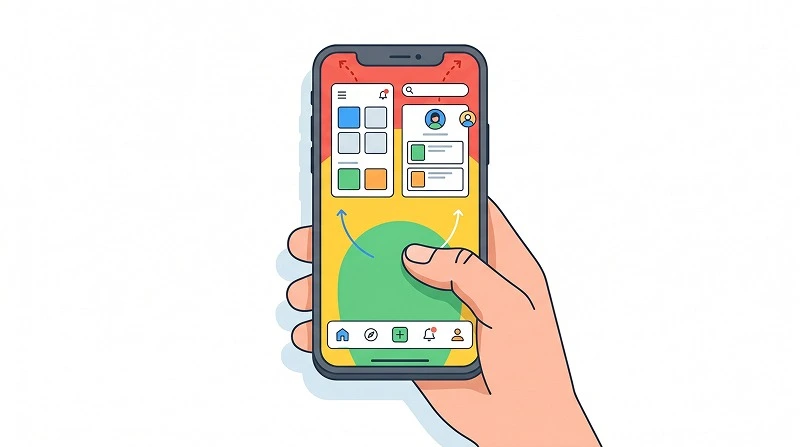
One of the most damaging bottom navigation bar design mistakes in mobile app UX is treating the bar as a visual footer instead of a primary ergonomic control. With 6‑inch+ phones, one‑handed use is the default scenario, not the edge case. The thumb zone — the area that’s comfortably reachable with the thumb — heavily influences which tabs get used most.
Research from Steven Hoober and others shows that ~49% of users hold their phones one‑handed most of the time. In my own field studies, especially in markets with heavy commuting, that number is even higher. If your most important action sits at the far left on a large device, right‑handed users will struggle; the reverse is true for left‑handers.
Designers often review screens on large monitors, forgetting how it feels on a physical phone. The result is bars with tiny tap targets, low contrast, and critical actions placed at the edges — exactly where reach is hardest.
4.2 Common ergonomic and interaction pitfalls
Ergonomic issues typically show up as:
- Small tap targets (< 44–48 pt high), leading to mis‑taps and frustration.
- Crowded icons with minimal spacing, especially when 5 items are forced in.
- Critical actions in the least reachable positions, usually far left or far right.
- No safe margins near gesture areas (home indicator, Android gesture bar).
These don’t always register as obvious “bugs”, but you’ll see them in session replays: users tapping twice, adjusting grip, or abandoning an action because it’s physically uncomfortable.
4.3 Fix: Design for the hand, not the Figma frame
To fix ergonomic issues:
- Respect minimum touch targets: 44–48 px (pts/dp) height with generous horizontal padding.
- Physically test on devices: hold the phone one‑handed and tap all items; note which feel strained.
- Place high‑frequency actions in the easiest reach:
– For right‑handers, center and lower‑right area are easiest.
– For left‑handers, center and lower‑left.
- Avoid stacking too many interactive elements near OS gesture areas; leave some breathing room.
If your app has a central FAB (floating action button), ensure it doesn’t obscure labels or steal space from the bottom bar. Balance reachability for both the bar and the FAB.
Learn more about: What Can I do With a Design System Json File
5. Are you mixing hierarchy, hiding essentials, or skipping feedback?
5.1 Blending primary and secondary actions in one bar
A more structural bottom navigation bar design mistake in mobile app UX is treating the bar as a dumping ground for everything: navigation, primary actions, filters, even settings. When you mix hierarchy levels — e.g., “Home”, “Search”, and “New Post” all as equal tabs — users struggle to build a consistent mental map.
In practice, I often see:
- A “Compose” or “New” tab that opens a modal instead of a destination.
- A “Settings” tab next to main navigation, even though it’s rarely used.
- A “Help” or “Support” tab with low frequency but high visual weight.
This breaks the implicit rule that bottom nav items lead to top‑level destinations, not transient actions. Users tap expecting a screen, not a one‑off overlay. When expectations are violated, they lose trust in the navigation system as a whole.
5.2 Hiding navigation behind gestures or fancy animations
Another mistake is over‑relying on gestures or animations at the expense of discoverability. Examples I’ve seen in the wild:
- A bottom bar that auto‑hides on scroll and doesn’t reliably reappear.
- Core actions only available via long‑press on a tab, with no visible affordance.
- Excessive microinteractions that delay state changes (e.g., slow color fades, bouncing icons).
While motion can reinforce understanding, it must never slow down interaction. Users care about getting things done, not watching your navigation perform.
5.3 Fix: Keep the bar for destinations, and give clear feedback
To restore hierarchy and trust:
- Reserve bottom nav for top‑level destinations that open full screens.
- Move primary actions to:
– Contextual buttons within screens.
– A FAB that clearly looks like an action, not a tab.
- Keep settings, help, legal, etc. inside Profile/Account or a secondary menu.
For feedback and behavior:
- Provide instant visual feedback on tap: state change, ripple, or highlight.
- Avoid hiding the bar unless you have a strong reason (full‑screen media, maps), and always provide a clear way back.
- Use motion sparingly to indicate tab change (e.g., simple slide or fade), keeping transitions under ~200–250 ms.
When in doubt, watch real users. If they hesitate or double‑tap, your navigation is not as obvious as you think.
Conclusion: How to systematically fix your bottom navigation today
Most bottom navigation failures are not caused by one dramatic flaw, but by a combination of small, compounding mistakes: too many tabs, vague labels, broken conventions, poor ergonomics, and mixed hierarchies. Together, these quietly erode trust and make your app feel “hard to use”, even if the visual design looks polished.
To improve your mobile app UX, treat the bottom bar as a strategic component, not just a visual element. Start by auditing your current design against these questions:
- Do we have more than 5 items in the bar, and are they all truly top‑level?
- Can users instantly understand each icon and label without explanation?
- Are we aligned with platform conventions, or forcing users to relearn basics?
- Have we tested thumb reach and tap comfort on real devices?
- Does every item lead to a destination, with clear, fast feedback?
From there, prioritize changes that reduce cognitive load and physical effort. As designers, our goal is to make navigation feel so natural that users barely notice it — they just get where they want to go, effortlessly. If you address these 10 bottom navigation bar design mistakes, your mobile app UX will feel simpler, faster, and more trustworthy — and your core features will finally get the engagement they deserve.