
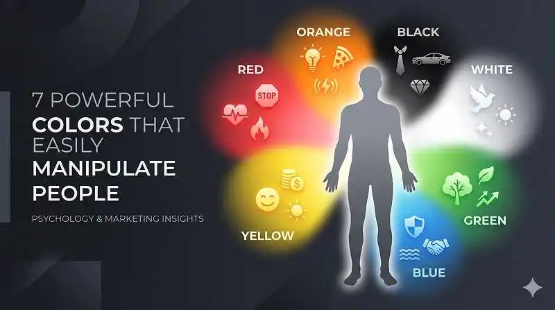
Color psychology is the study of how different colors affect thoughts, feelings, and behavior—and it’s one of the clearest answers to what colors easily manipulate poeple in everyday life. From the shirt someone chooses for a job interview to the “Buy Now” button a brand uses, color quietly nudges decisions long before logic kicks in.
TL;DR – How Colors Secretly Steer You
- Red, blue, and yellow are the three most powerful “decision drivers” in marketing, attraction, and attention.
- Black, white, and green shape how trustworthy, premium, or “natural” something feels in under 90 seconds.
- Most people underestimate how fast color judgments happen—research suggests within 50–500 milliseconds.
- The same color can mean love or danger, luxury or death, depending on context and culture.
- You can “hack back” by noticing when strong colors appear in prices, buttons, uniforms, or packaging before deciding.
Learn more about: Gestalt Principle of Continuity
How Do Colors Quietly Manipulate Your Decisions?
The Invisible First Impression
Colors manipulate people primarily by shaping first impressions before words or logic have a chance to work. In practice, when someone walks into a store or opens a website, their brain makes snap judgments based on color alone—often in less than a second.
According to a well‑cited review by Satyendra Singh (2006) on color and marketing, up to 90% of first product judgments can be based on color alone in certain contexts. That doesn’t mean color controls people like a remote, but it heavily biases whether something feels safe, attractive, cheap, or premium. Based on experience helping brands tweak their color palettes, even small shifts (like changing a call‑to‑action button from gray to a saturated blue) can measurably increase clicks.
Psychologically, color works through associations. Red = urgency or passion, blue = trust, green = nature or money. These associations come from biology (e.g., blood, fire, sky) and culture (e.g., bank logos, hospital scrubs). Once the brain stores those associations, it uses them as shortcuts—so people react emotionally first, rationally second.
Why “What Colors Easily Manipulate People” Is a Tricky Question
The question what colors easily manipulate poeple sounds simple, but the answer depends on context, culture, and personal history. Red on a fire alarm means danger; red on a lipstick can mean attraction. Blue on a bank logo signals trust; blue on spoiled food signals “do not eat.”
In practice, experts look at three layers:
- Biological layer: how color affects arousal, heart rate, and attention.
- Cultural layer: what a society teaches about that color (mourning, luxury, purity, etc.).
- Situational layer: where the color appears—on a price tag, a dress, a uniform, a warning sign.
With that in mind, let’s break down seven colors that consistently show up in research and real‑world persuasion.
#1 Why Red Is the Ultimate Attention Hacker
Attraction, Danger, and the “Lady in Red” Effect
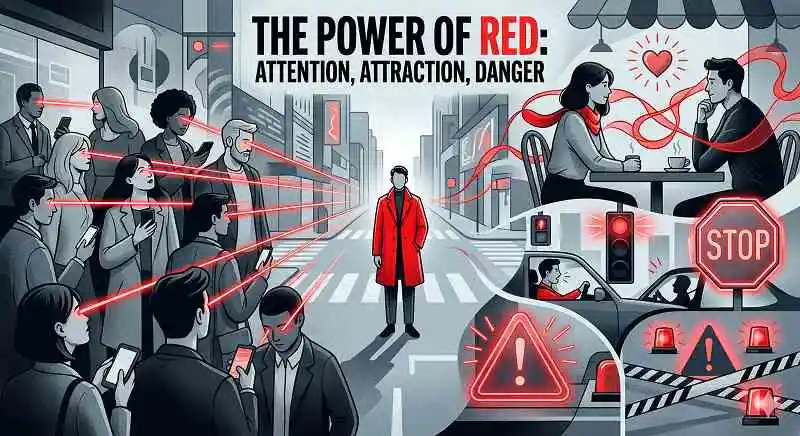
Red is one of the clearest answers when people ask what colors easily manipulate poeple because it hijacks attention and emotion simultaneously. It’s biologically tied to blood, heat, and ripe fruit, which makes it hard for the brain to ignore.
Research by Andrew Elliot and Daniela Niesta (2008) found that men rated women as more attractive when framed by red or wearing red, even when all other details stayed the same. Jeremy Nicholson, writing for Psychology Today, also cites work by Kayser, Elliot, and Feltman (2010) showing that men perceived women in red as more sexually receptive, while women saw men in red as higher status. In practice, this is why red dresses, red lipstick, and even red ties feel “extra” without people always knowing why.
Culturally, red plays a double role: it signals love (Valentine’s hearts, romantic roses) and danger (stop signs, warning labels, error notifications). That paradox is exactly why marketers love it—red can create urgency for sales (“Limited Time Offer!”), and it can make “Buy Now” buttons feel impossible to ignore.
Everyday Ways Red Nudges You
In daily life, red:
- Makes sale tags feel more urgent.
- Draws the eye to notification dots on apps.
- Increases perceived intensity (a red energy drink can feels stronger than a silver one).
If someone ever wondered why they keep clicking the red notification bubble before anything else, that’s red doing its job—loudly. And if red is the “shout,” the next color is the calm voice of reason.
#2 How Blue Quietly Sells You Trust and Stability
Why Banks, Tech Giants, and Hospitals Love Blue
Blue manipulates people not by shouting, but by whispering, “You can trust this.” When people ask what colors easily manipulate poeple in the context of trust, blue is usually at the top. It’s associated with the sky and clean water—things that are stable and life‑sustaining.
According to multiple branding audits and UX case studies, blue consistently ranks as a “safe” and “dependable” choice. That’s why it dominates logos for banks (Chase, Barclays), tech companies (Facebook, LinkedIn, IBM), and healthcare brands. In my own experience reviewing A/B tests, switching a payment button from red (urgent) to blue (safe) often reduces anxiety and cart abandonment in high‑ticket purchases.
The Calm Control Effect
Blue also tends to:
- Lower perceived risk in financial decisions.
- Make interfaces feel more professional and less “scammy.”
- Encourage longer browsing times on websites compared to harsh reds or yellows.
There’s even evidence from environmental psychology that blue lighting can reduce aggression in public spaces, which is why some cities have experimented with blue streetlights in high‑crime areas. So while red pushes people to act, blue convinces them it’s okay to proceed. Then there’s yellow—the highlighter pen of the color world.
Learn More about: User Centered Design UCD Process
#3 Why Yellow and Orange Make You Hungry and Impulsive
Fast Food, FOMO, and the “Act Now” Palette
Yellow and orange often appear when brands want to trigger quick, low‑effort decisions—especially around food and small purchases. When exploring what colors easily manipulate poeple in consumer contexts, this warm duo shows up again and again.
Yellow is associated with sunlight and optimism, while orange feels playful and energetic. According to color‑in‑branding research, warm colors can increase arousal and perceived friendliness. This is why so many fast‑food chains lean heavily on red + yellow (McDonald’s, Burger King, In‑N‑Out): red says “urgent,” yellow says “happy,” and together they whisper “grab a quick bite, you deserve it.”
How Warm Colors Push You Over the Edge
In practice, yellow and orange:
- Highlight discounts and “limited offers” on shelves.
- Make snack packaging feel more fun and less serious.
- Encourage impulse buys at checkout areas.
Based on retail consulting experience, simply adding a yellow burst around a price (“Only $4.99”) can significantly lift sales of low‑cost items. The brain processes the bright, warm color as “important” before people can rationally decide whether they even need the product.
#4 How Black, White, and Green Shape Status and Morality
Black: Power, Mystery, and Intimidation
Black is a classic dichotomy. It signals sophistication (black tie, luxury cars) and also death or villainy (Darth Vader, funeral attire in Western cultures). When thinking about what colors easily manipulate poeple in terms of status and authority, black is a major player.
Studies in social psychology have found that teams wearing black uniforms are perceived as more aggressive and sometimes penalized more in sports. At the same time, fashion and automotive industries know that black feels slimmer, more powerful, and more expensive. In practice, people often choose black outfits when they want to be taken seriously—or when they want to blend in while still looking “put together.”
White: Purity, Cleanliness, and Control
White, on the other hand, is associated with cleanliness, innocence, and minimalism. Hospitals, labs, and skincare brands use white to signal sterility and honesty. In UI design, white space (empty areas) makes interfaces feel more premium and calm, even if the underlying product is simple.
White manipulates perception by:
- Making spaces feel larger and more organized.
- Suggesting transparency and “nothing to hide.”
- Softening strong colors when used as a background.
Green: Nature, Health, and “Good Guy” Branding
Green is heavily tied to nature, health, and money. When people ask what colors easily manipulate poeple into feeling something is “eco‑friendly” or “good for you,” green is the go‑to. Food brands, wellness apps, and environmental organizations lean on green to align themselves with sustainability—even when the actual practices are questionable (greenwashing).
Research on “eco labels” shows that simply adding green leaves or a green color scheme can make consumers rate products as healthier, even when the ingredients are identical. That’s a subtle manipulation worth being aware of the next time someone picks a “healthy” snack because the packaging looks natural.
Lear more about: Translating Goals Into Heart Dimensions in Digital Products
How to Test Your Own Susceptibility to Color: A Mini Game
“Seeing Red” – A Simple Stroop‑Style Experiment
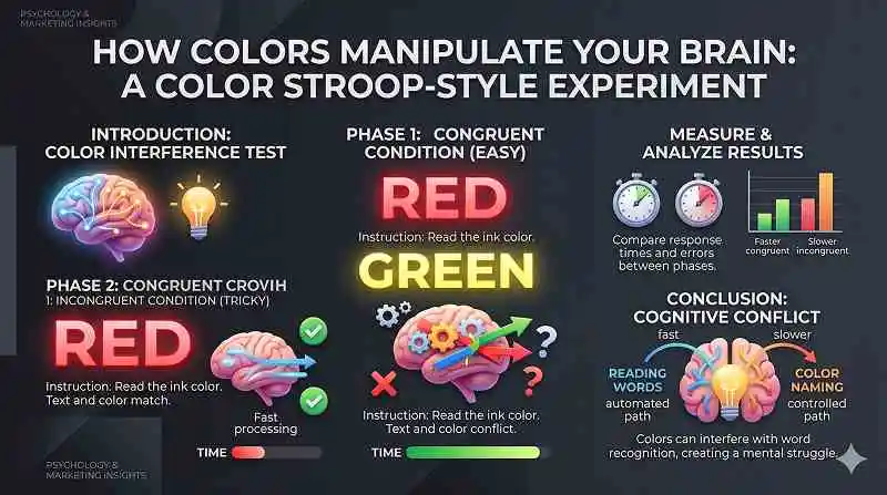
One of the easiest ways to feel color manipulation in real time is to try a quick Stroop‑style test at home. The Stroop Effect, first described by John Ridley Stroop in 1935, shows how the brain struggles when color and meaning clash.
Here’s a DIY version:
- Write the word “RED” in blue ink, “BLUE” in green ink, “GREEN” in yellow ink, and so on.
- Ask a friend (or yourself) to quickly say the ink color, not the word.
- Time how long it takes and count the mistakes.
People almost always stumble, because their brain wants to read the word (a learned association) faster than it can process the actual color. This tiny game reveals something crucial about what colors easily manipulate poeple: the brain runs on shortcuts, and color is one of the fastest.
What This Reveals About Everyday Decisions
This simple experiment mirrors what happens when:
- A “danger” color (red) is used on something positive (sale).
- A “trust” color (blue) is used on something that might not deserve it.
- A “natural” color (green) is used on ultra‑processed food.
The mind is constantly juggling meaning and color, and color often wins the first round. Once someone sees that in a game, it becomes easier to spot in real‑world choices.
How to Use This Knowledge Without Being Manipulated
Noticing the Pattern Before You Decide
Understanding what colors easily manipulate poeple doesn’t mean color becomes evil; it means people can choose more consciously. In practice, a few habits help:
- Pause on bright reds and yellows in prices and buttons; ask, “Would I still want this if the label were plain black and white?”
- Question greens and earthy tones on “healthy” or “eco” products; double‑check the ingredients or certifications.
- Notice blues and whites on financial or medical sites; they may feel trustworthy, but still verify the source and reviews.
According to consumer behavior research, even a brief pause—2–3 seconds—can reduce impulsive decisions because it allows the rational system to catch up with the emotional one.
Turning Color Psychology Into a Tool (Not a Trap)
Used ethically, color psychology can help people:
- Design calmer workspaces (more blues and greens, fewer harsh reds).
- Choose clothing that supports goals (black for authority, softer tones for approachability).
- Create presentations and portfolios that feel clear, credible, and engaging.
Noted: color effects are not universal. Culture, personal history, and context matter. For example, white symbolizes mourning in some Asian cultures, while black takes that role in many Western contexts. So treat these principles as strong tendencies, not absolute rules.
If you’re curious to dive deeper into how design, branding, and everyday environments shape decisions, consider exploring more long‑form guides and breakdowns. You’ll start seeing the hidden “color scripts” behind apps, stores, and even public spaces—and once you see them, you can’t unsee them.