

Most product teams treat interaction design design as “how things look and where buttons go,” but the real job is designing how people and systems talk to each other over time. When teams skip that deeper layer and jump straight to screens, they ship products that feel clunky, confusing, or exhausting to use.
Learn more about: Hierarchical Task Analysis
TL;DR – Key Points
- The big mistake: designing static screens instead of dynamic interactions.
- Good interaction work focuses on user goals, system feedback, and behavior over time.
- A simple 5‑dimension model (words, visuals, physical context, time, behavior) helps you spot issues fast.
- Interaction designers ask a consistent set of questions about each dimension to avoid blind spots.
- You can quickly improve a product by mapping critical flows, tightening feedback, and simplifying choices.
What is interaction design design and why does this mistake matter?
A clear definition and how it fits under UX
Interaction design design is the practice of shaping how users act, get feedback, and progress through a product to achieve their goals with minimal friction. It sits under the larger umbrella of user experience (UX) design, which also includes research, information architecture, content strategy, and usability testing. If UX is about the overall journey, interaction work is about each “turn of the wheel” as the user moves forward.
Based on experience, the most damaging mistake product teams make is treating interfaces as a series of static screens instead of as a continuous conversation. They obsess over layouts, colors, and one-off components, but they rarely ask, “What exactly happens when the user taps this? What do they see next? How fast? With what message?” That gap is where confusion, errors, and drop‑offs creep in.
A common real-world example is signup flows. Teams design a beautiful signup screen, but they don’t design the interaction: what happens if the user mistypes their email, if the password is weak, if the network is slow, or if they abandon halfway and return later? According to industry research from the Baymard Institute, complex or frustrating account creation flows can cause over 20% of users to abandon a product entirely. That’s not a visual design problem; it’s an interaction design failure.
How interaction work overlaps with and differs from UX
Interaction design overlaps heavily with UX because most of the “experience” happens as people do things: tapping, scrolling, typing, waiting, correcting, and deciding. However, UX also includes upstream and downstream activities that are not strictly interaction work, such as:
- Planning research studies and interviewing users.
- Defining personas and scenarios.
- Mapping end-to-end journeys across multiple channels.
- Evaluating business impact and product-market fit.
In practice, interaction designers often participate in these activities, but their core responsibility is to turn insights into concrete behaviors in the interface. They answer questions like, “What are the possible states here?” and “How do we prevent or recover from errors gracefully?” When teams skip that step, they end up with experiences that look polished in Figma but fall apart in real usage.
What are the 5 dimensions of interaction design design?
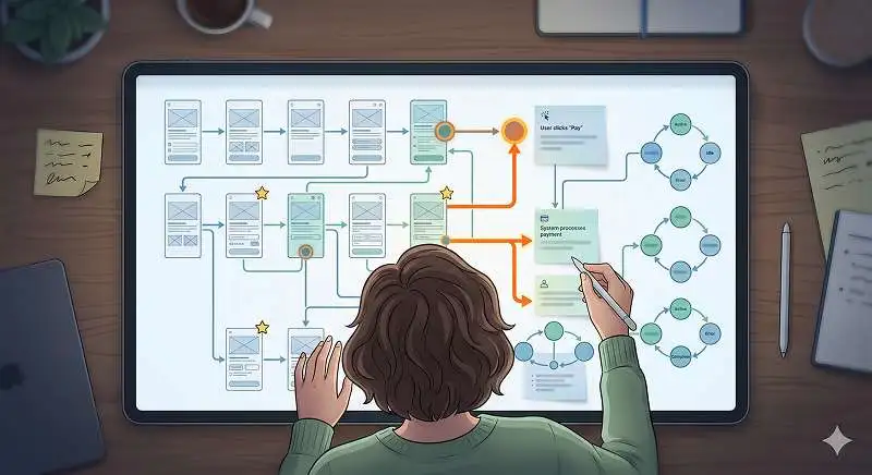
A practical model: words, visuals, physical context, time, behavior
A useful way to think about interaction design design is through five dimensions that always show up in real products:
- Words
- Visual representations
- Physical objects and space
- Time
- Behavior
When I review a struggling product, I walk through each dimension and ask, “Where is this breaking down?” This structure turns vague “UX problems” into specific, fixable issues.
1. Words: microcopy that guides action
Words are the labels, button texts, error messages, and short explanations that tell users what they can do and what will happen. The goal is clarity, not cleverness. Research shows that even small changes in microcopy (like changing “Submit” to “Create account”) can significantly increase task completion because users better understand the outcome.
A common failure is ambiguous or overloaded labels. For example, a “Continue” button at the end of a form is vague: continue to what? In practice, I’ve seen conversion lifts simply by renaming such a button to “Review order” or “Confirm details,” because it sets the right expectation about the next interaction.
2. Visual representations: structure, hierarchy, and affordances
Visual representations include layout, icons, typography, and color used to communicate what is interactive and what is informational. The goal is to make the interface “speak” without requiring the user to think too hard. An icon that looks like a button should behave like one; a primary action should visually stand out from secondary ones.
A real-world example: a mobile banking app where the “Transfer” and “Delete payee” actions are styled identically. Users hesitate because they’re afraid of tapping the wrong thing. Good interaction work uses visual hierarchy to make the safest, most common actions obvious and the dangerous ones clearly distinct.
3. Physical objects and space: device, posture, and environment
Physical objects and space cover the hardware (phone, laptop, kiosk), input methods (mouse, keyboard, touch, voice), and the environment (on a bus, in a store, at a desk). These factors change what is feasible and comfortable. A design that works well on a desktop with precise mouse input may fail on a crowded subway where users operate with one thumb and intermittent connectivity.
In practice, I always ask where and how people will use the product. For a warehouse scanning app, for example, the interaction must work with gloves, poor lighting, and potentially no network. That leads to larger tap targets, offline states, and clear, high-contrast feedback.
4. Time: feedback, animation, and pacing
Time is about what happens between states: loading, transitions, animations, and delays. According to experts in human-computer interaction, feedback within 0.1 seconds feels instantaneous; within 1 second feels responsive; beyond that, users start to feel the system is slow unless you communicate progress clearly.
A common real-world example is a “Save” button that appears to do nothing for a second or two. Without a spinner, progress bar, or “Saved” confirmation, users often tap multiple times, leading to duplicate submissions or errors. Good interaction work deliberately designs these temporal moments so users always know what’s happening.
5. Behavior: user and system responses
Behavior is the combined pattern of what users do and how the system responds: flows, edge cases, errors, and recovery paths. This is where the other four dimensions meet. It answers questions like, “If the user does X in state Y, what should happen?” and “What’s the safest default behavior here?”
In practice, behavior is where most teams underinvest. They design the “happy path” but ignore what happens when data is missing, permissions fail, or the user changes their mind. Industry standards in resilient systems design emphasize graceful degradation and clear recovery paths, yet many products still crash or dead-end users instead of helping them recover.
Learn more about: Process User Experience ,
What questions do strong interaction designers ask on every project?
Questions about basic actions and controls
Strong interaction designers use a consistent set of questions to avoid blind spots. The first set focuses on what users can physically do in the interface:
- What can a user do with their mouse, finger, keyboard, or stylus at this moment?
- Which actions are primary, secondary, or dangerous, and how do we signal that?
- What happens if the user changes their mind right after they act?
Based on experience, simply listing all possible user actions on a key screen often reveals missing states. For example, a checkout page where the user can change quantities, apply coupons, and update addresses might require several confirmation and error patterns that the team hadn’t designed.
Questions about clarity, context, and feedback
The next cluster of questions focuses on understanding and feedback:
- Is it obvious what each control does before the user interacts with it?
- What immediate feedback does the user get after an action?
- How does the interface explain errors and next steps in plain language?
Worth noting: many teams rely on placeholder text or generic error messages like “Something went wrong.” That forces users to guess what to do next. A better pattern is to state what happened, why (if known), and what the user can do now: “We couldn’t save your changes because your internet connection dropped. Your edits are stored locally and will sync when you’re back online.”
Questions about edge cases and real-world constraints
Finally, strong practitioners pressure-test their designs with questions about edge cases and constraints:
- What happens if the network is slow or unavailable?
- How does this interaction work for first-time users versus experts?
- What if the user is interrupted mid-flow and returns later?
In practice, running through these questions on a single critical flow—like password reset or payment—often exposes more real usability issues than a full UI review. It forces the team to think about the product as a living system in a messy world, not a set of idealized mockups.
What do interaction designers actually do day to day?
Turning requirements into interaction flows and states
Interaction designers translate product requirements and research insights into concrete flows, states, and behaviors. Instead of jumping directly into high-fidelity visuals, they typically start with:
- User flows or storyboards that show step-by-step progress.
- Low-fidelity wireframes that map actions and feedback.
- State diagrams to capture how screens change based on conditions.
In many real-world teams, the fastest way to fix a broken experience is to have an interaction designer redraw the core flow on a whiteboard, mapping every state and transition. This makes missing pieces—like what happens after an error—immediately obvious to everyone.
Collaborating across UX, engineering, and product
Interaction design design is inherently cross-disciplinary. Practitioners work closely with:
- UX researchers to understand user goals, behaviors, and mental models.
- Visual designers to align behaviors with brand and aesthetics.
- Engineers to ensure the interactions are technically feasible and performant.
- Product managers to align flows with business goals and constraints.
According to experts in high-performing product organizations, this cross-functional collaboration is what turns interaction ideas into shippable reality. When interaction designers sit in isolation, they often propose behaviors that are too expensive or misaligned with technical constraints; when they collaborate early, they can design within real limits while still improving the experience.
Prototyping, testing, and iterating on behavior
Day to day, much of the work involves prototyping and testing:
- Building interactive prototypes (from simple click-throughs to coded experiments).
- Running usability tests to see how people actually interact.
- Measuring outcomes like task success rate, time on task, and error frequency.
- Iterating flows and microinteractions based on evidence.
From experience, even a handful of usability sessions with a rough prototype can reveal whether an interaction is working. Industry standards suggest that testing with 5–8 users often uncovers the majority of high-severity usability issues in a flow. This is where the craft pays off: subtle tweaks to timing, wording, or layout can dramatically change how confident and in-control users feel.
How can your team quickly fix interaction design design issues?
Step 1: Map and prioritize your critical interactions
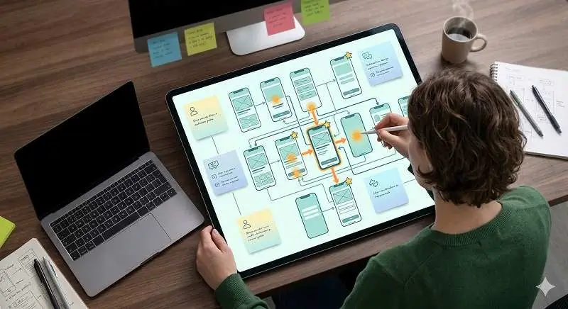
To fix interaction design design problems fast, start by identifying your product’s “money paths”—the flows that matter most to users and the business (e.g., sign up, first-time setup, purchase, key daily task). Map each as a simple step-by-step flow, including forks and possible errors.
Then, for each step, list:
- What the user wants to do.
- What actions are available.
- What feedback they get after acting.
- What happens if something goes wrong.
This exercise often surfaces immediate gaps: missing confirmations, unclear labels, or dead-end error states. In my experience, teams can find and fix high-impact issues in a single working session just by making these flows explicit.
Step 2: Tighten feedback, reduce choices, and clarify language
Next, focus on three levers that usually yield fast improvements:
- Feedback: Add instant, visible responses for every key action (loading indicators, success messages, inline errors).
- Choices: Reduce the number of decisions per screen; group related actions and hide rarely used options behind secondary menus.
- Language: Replace vague labels with specific, outcome-oriented wording.
Avoid this common mistake: adding more instructions instead of improving the interaction itself. If you need a paragraph to explain how to use a control, the control is likely wrong. Redesign the interaction so that the most natural action is also the correct one.
Step 3: Test with real users in real contexts
Finally, validate your changes with quick, focused tests:
- Ask users to perform 2–3 critical tasks while thinking aloud.
- Observe where they hesitate, mis-tap, or misinterpret labels.
- Note not just what they say, but how their behavior changes.
Worth noting: you don’t need a full formal study to learn a lot. Even informal sessions with a few representative users can reveal whether your interaction changes are actually helping. The key is to watch real behavior, not rely on internal opinions.
How can you go deeper and build lasting interaction design skills?
Explore specialized areas: motion, sound, and advanced prototyping
Once you’ve addressed the big interaction design design gaps, you can deepen your practice in specialized areas:
- Motion design: Use subtle animations to explain spatial relationships, confirm actions, and guide attention.
- Sound design: Add meaningful audio cues for critical events (e.g., confirmations, alerts) in contexts where users may not be looking at the screen.
- Advanced prototyping: Build high-fidelity interactive prototypes that closely mimic real behavior, including edge cases and timing.
According to research in cognitive psychology, well-designed motion and sound can reduce cognitive load by making system changes easier to perceive and interpret. However, overusing these elements can create distraction, so the principle is always “as much as needed, as little as possible.”
Study patterns, standards, and real products
To build intuition, systematically study:
- Platform guidelines (e.g., Apple Human Interface Guidelines, Material Design).
- Established design systems and their interaction patterns.
- Successful apps in your domain, focusing on flows rather than just visuals.
In practice, I recommend picking a product you admire and reverse-engineering one flow: capture each state with screenshots or sketches, then annotate what the user does and what the system does. This builds a mental library of proven patterns you can adapt.
Learn from data, not just opinions
Finally, treat interaction design as a testable hypothesis, not an art project:
- Use analytics to track where users drop off or repeat actions.
- Run A/B tests on alternative flows or microinteractions when feasible.
- Combine quantitative data with qualitative feedback from research.
Industry standards in product teams emphasize this loop: design → ship → measure → refine. Over time, this feedback cycle sharpens your judgment about which interaction choices actually improve outcomes and which are just cosmetic.
Learn more about: Integrating AI Into Human Workflows
Conclusion: The fastest way to stop making this interaction mistake
The core mistake almost every product team makes is designing static screens instead of the full interaction design design: the continuous, stateful conversation between user and system across words, visuals, context, time, and behavior. The fix is not more polish, but more structure and intention.
To act immediately:
- Map your top 2–3 critical flows as step-by-step interactions.
- Use the five dimensions model to review each step for gaps.
- Tighten feedback, reduce choices, and clarify language where users hesitate.
- Validate with quick usability tests and real usage data.
When you consistently design interactions—not just interfaces—you ship products that feel intuitive, trustworthy, and efficient. Over time, this discipline turns guesswork into a repeatable craft, and your team stops rediscovering the same mistakes in every new feature.