
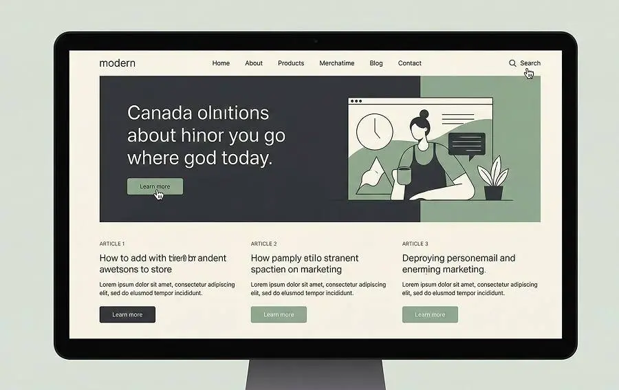
Good content is essential for any business or brand. But what makes content truly effective? While the quality of the information matters, the design is just as important in ensuring that content engages and resonates with its audience. In this article, we will explain how design is important to the content and how a thoughtful design can significantly enhance the user experience, drive engagement, and ultimately improve business results.
Learn more about: Elements and Principles of Design
The Role of Design in Content
Design is not just about aesthetics—it’s about function. A well-designed piece of content ensures that the message is communicated clearly, and it improves the overall user experience. Design helps break down barriers between the message and the audience by making the content visually engaging, easy to navigate, and simple to understand.
When design and content work together, they create a seamless experience. Design aids in guiding the reader’s eye, highlighting key messages, and improving content comprehension. By incorporating smart design choices, you not only present information effectively but also foster deeper connections with your audience.
Why Design Matters for Content
1. Visual Hierarchy: Guiding the Reader’s Eye

One of the most crucial aspects of content design is visual hierarchy. This is the arrangement of elements in a way that guides the reader’s eye to the most important parts of the content first. Through clever use of font size, color contrast, spacing, and alignment, design creates a natural flow that helps readers easily navigate the content.
For example, large headings and bold text attract attention and tell readers where to begin. Bright colors or larger fonts can be used to highlight key points or calls to action. Smaller text or light colors, on the other hand, help fill in the background or less important details.
A clear visual hierarchy improves readability and ensures that your message doesn’t get lost in a sea of text or clutter. When applied well, it helps readers absorb the key points without feeling overwhelmed, leading to higher engagement and comprehension.
2. Typography and Readability: Making Content Easy to Consume
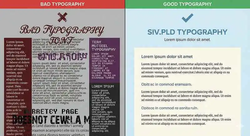
The choice of typography plays a critical role in how users interact with content. Good typography ensures that content is easy to read, regardless of the device or screen size. Fonts should be clear, legible, and not too distracting.
Simple fonts like Arial, Helvetica, or Times New Roman work best for readability. Using too many different fonts can make content feel chaotic and distract readers from the message. Proper line spacing (known as leading) is also essential to improve the flow of the text, allowing readers to easily follow along without strain.
When typography is used correctly, it supports the structure of the content, making it easy to read and understand. This leads to a better user experience, encouraging visitors to stay longer and engage more with the content.
3. Whitespace: Enhancing Focus and Clarity

Whitespace (or negative space) is the area around and between design elements. It’s often an underappreciated aspect of design but plays a significant role in enhancing readability and focus. Whitespace prevents content from feeling cramped and chaotic, giving the eyes room to breathe.
When used effectively, whitespace draws attention to key areas, like headlines or calls to action. It also makes the content feel less overwhelming and easier to digest. Well-placed whitespace helps separate different sections of content, making it more visually appealing and easier to scan.
Not only does whitespace improve the aesthetics of the content, but it also boosts the content’s clarity. With fewer distractions, readers can focus on what’s important, enhancing their ability to understand and retain information.
4. Brand Consistency: Strengthening Your Message Through Design
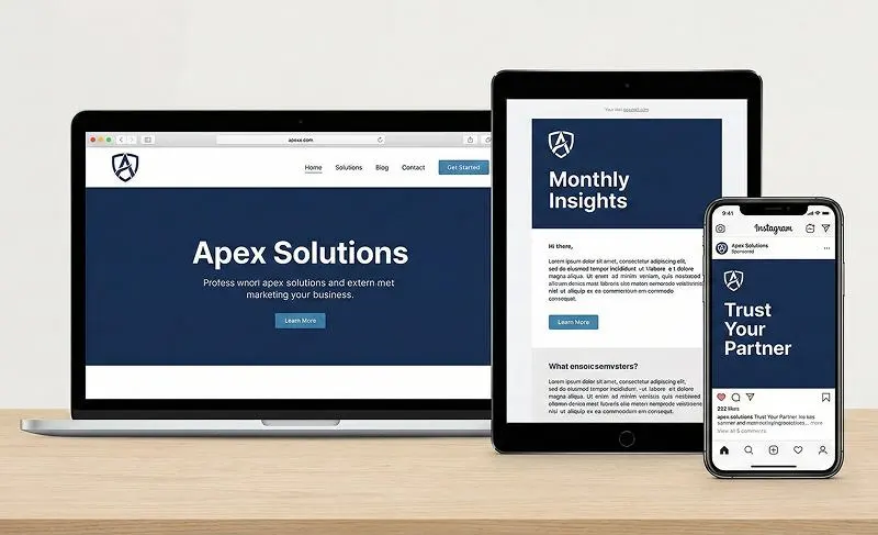
Maintaining brand consistency across all your content is essential to building recognition and trust. Consistent use of design elements such as colors, fonts, and logo placement strengthens your brand’s identity and ensures that your content feels cohesive.
Brand colors, for instance, aren’t just for decoration—they evoke specific emotions and reinforce your brand’s values. For example, blue often conveys trust and professionalism, while red can invoke excitement or urgency. By using these elements consistently, you create a recognizable identity that resonates with your audience and builds loyalty.
When your content’s design is consistent, it becomes easier for your audience to connect with your brand, which increases trust and encourages long-term engagement.
5. User Experience: Designing Content for Engagement and Retention

Design is a key factor in shaping user experience (UX). A well-designed content experience can keep users engaged and encourage them to return. Good UX doesn’t just focus on how things look but how users interact with content. It’s about making sure visitors can easily find what they’re looking for and have an enjoyable experience while doing so.
Interactive elements like quizzes, polls, or videos can make content more engaging. Moreover, ensuring that your content is mobile-friendly is essential. As more people browse the web on their phones, content that doesn’t work well on smaller screens can frustrate users and drive them away. By focusing on a smooth and intuitive user experience, you increase the likelihood that visitors will stay longer, take action, and become repeat customers.
Learn more about: approach graphic in UX design
6. Common Design Mistakes That Hurt Content Impact
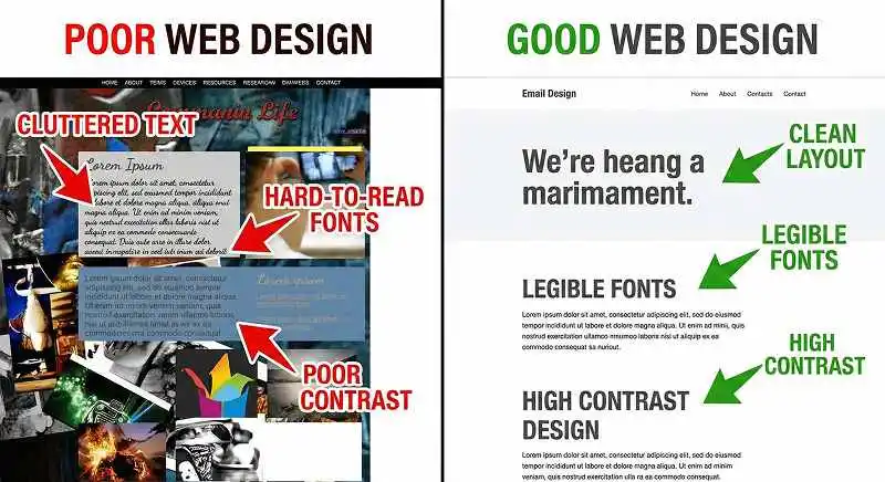
While good design is crucial for content, poor design can have the opposite effect. Common mistakes include:
- Poor Contrast: When text blends too much with the background, it becomes hard to read. Always ensure there’s enough contrast between your text and background colors.
- Cluttered Layouts: Too many images, colors, or fonts can overwhelm readers and make the content difficult to follow. A clean, simple layout improves focus.
- Inconsistent Branding: Inconsistent fonts, colors, and styles can confuse readers and damage your brand’s identity. Always stick to a style guide to maintain coherence.
- Unreadable Fonts: Using small fonts or overly stylized fonts can make reading a chore for your audience. Choose fonts that are easy to read and appropriate for the context.
By avoiding these design pitfalls, your content becomes more accessible, engaging, and impactful.
Conclusion: Design and Content Working Together
When design is carefully paired with content, the result is a seamless, engaging experience that drives user interaction and boosts retention. Good design not only makes your content easier to read and follow, but it also strengthens your message, improves user experience, and reinforces your brand’s identity.
To maximize the impact of your content, focus on creating a visual hierarchy, choosing readable typography, incorporating whitespace, maintaining brand consistency, and ensuring a great user experience. By doing so, you ensure that your content resonates with your audience and achieves its desired goals.
Remember, content may be king, but design is the key to making sure your content reaches its full potential.
Learn more about: Can Prompting be Used to Create Screens in Figma