
This guide introduces the elements and principles of design, foundational concepts you can apply to almost any kind of visual work, from posters and presentations to UI screens and illustrations. Each concept includes a short definition and a clear explanation of how the concept works in practice.
The ideas here are not the only “correct” ways to use each concept. Design fundamentals are flexible tools, not strict rules. Once you understand each idea, revisit visuals you see every day and try spotting where these fundamentals are doing the heavy lifting.
Learn more about: how do you start building your information architecture
Tip: After you become familiar with each concept, review a few visuals you like and identify which elements and principles are most responsible for the result.
Elements of Art and Design
LINE
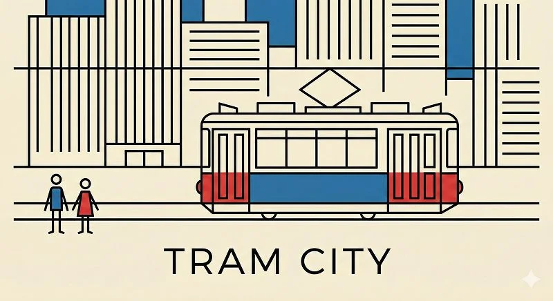
Line is a straight or curved mark that connects two points or traces the path of a moving point. Lines vary in weight (thick or thin), direction, length, and can also be implied.
Key qualities:
- Weight: thick, thin, or varied
- Direction: horizontal, vertical, diagonal, curved
- Length: short or long
- Implied lines: invisible paths created by gaze, alignment, or movement
How it works in practice:
Line can define structure, guide attention, and set the emotional tone of a design. Consistent, straight lines often feel orderly and stable, while curved or diagonal lines can feel energetic, expressive, or directional. Implied lines are especially powerful because they can lead the viewer’s eye without adding clutter.
SHAPE
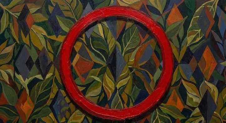
Shape is a two-dimensional enclosed area defined by height and width. Shapes can be geometric (hard-edged) or organic (soft-edged and irregular).
Key qualities:
- Geometric: circles, squares, triangles
- Organic: irregular, nature-like forms
- Positive shapes (objects) versus negative shapes (spaces)
How it works in practice:
Shapes create the basic language of a composition. Geometric shapes usually feel precise and structured, while organic shapes feel natural and fluid. When shapes overlap, repeat, or contrast, they can create hierarchy, meaning, and visual interest without relying on detailed imagery.
FORM
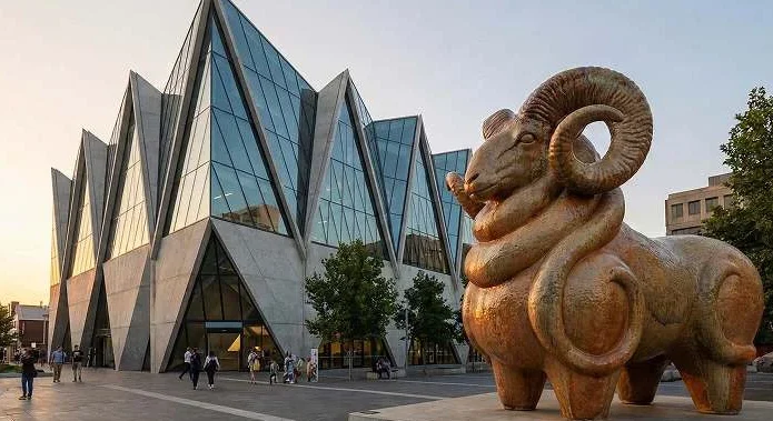
Form is a three-dimensional object with height, width, and depth. Forms can be geometric (precise and measured) or organic (irregular and natural).
Key qualities:
- Geometric form: cubes, pyramids, architectural structures
- Organic form: rounded, imperfect forms found in nature
- Light and shadow help communicate depth
How it works in practice:
Form makes visuals feel physical and dimensional. Geometric forms can communicate strength, reliability, and structure. Organic forms often feel approachable and expressive. Even in flat design, you can suggest form through shading, perspective, layering, and scale.
Learn more about: Four Design Principles
COLOR
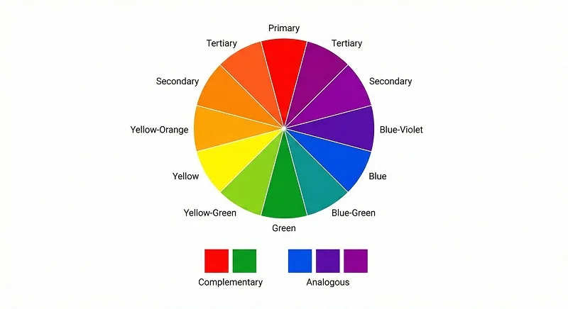
Color is the perception of light reflected from a surface. It has three main characteristics: hue, value, and intensity. Colors are often described as warm or cool based on their position in the spectrum.
Key qualities:
- Hue: the color family (red, blue, yellow)
- Value: how light or dark the color is
- Intensity: how bright or dull the color is
- Warm vs cool: energy versus calm
How it works in practice:
Color shapes mood and hierarchy fast. Warm colors often feel active and attention-grabbing, while cool colors feel calm and stable. High-intensity colors can become focal points, while muted colors tend to support. Color relationships like complementary (high contrast) and analogous (harmonious) help you control emphasis and cohesion.
VALUE

In visual design, value refers to how light or dark a color appears. Strong value contrast helps separate objects in space, while smooth value gradation can suggest volume and contour.
Key qualities:
- High contrast: strong separation and clarity
- Low contrast: softness and subtlety
- Gradation: smooth shifts that suggest depth
How it works in practice:
Value is one of the most reliable ways to create clarity. High value contrast improves legibility and makes focal points obvious. Gradation can make objects look rounded, create depth, and help a flat composition feel more dimensional. If your design feels “flat” in a bad way, value is often the missing piece.
SPACE
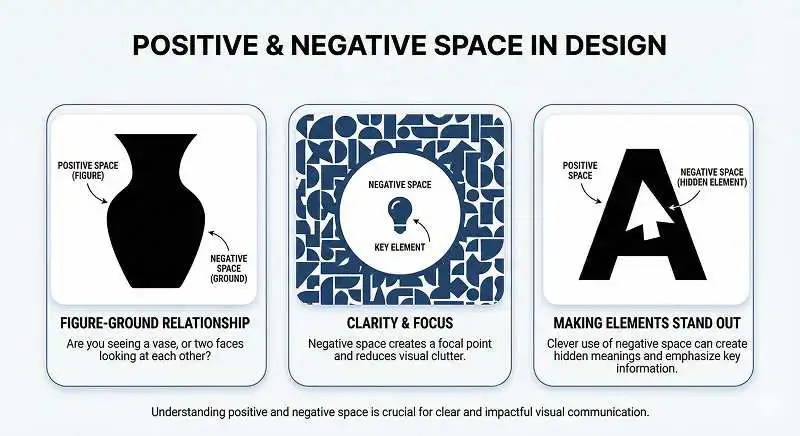
Space refers to the areas around, between, and within elements in a design. It includes positive space (occupied by objects) and negative space (empty or unoccupied).
Key qualities:
- Positive space: the subject and visible forms
- Negative space: breathing room and clarity
- Figure-ground: the eye can switch what it sees as “object” and “background”
How it works in practice:
Space creates readability and focus. Negative space reduces visual noise and makes key elements easier to notice. Space can also create clever figure-ground effects where the meaning changes depending on what the viewer perceives as foreground or background. In UI and editorial design, space is often what makes layouts feel premium and easy to scan.
TEXTURE
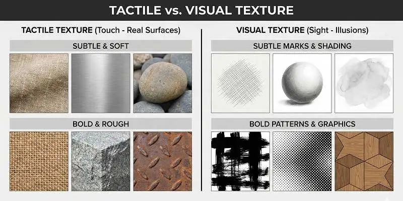
Texture is the surface quality of an object. It can be tactile (felt by touch) or visual (suggested through imagery).
Key qualities:
- Tactile texture: real physical surface (fiber, stone, metal)
- Visual texture: simulated texture through marks, paint, or shading
How it works in practice:
Texture adds realism, warmth, and depth. Tactile texture is about material truth, while visual texture is about what your eyes believe. Subtle texture can reduce the sterile feel of flat surfaces, while strong texture can become a focal element. The key is control, because too much texture can also overwhelm.
Learn more about: What Is the Good Design
Principles of Art and Design
BALANCE
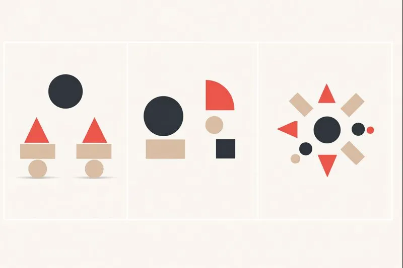
A composition feels balanced when its visual weight is distributed in a stable way. This balance can be symmetrical, asymmetrical, or radial, depending on how elements are arranged.x`
Types of balance:
- Symmetrical: mirrored sides feel equal
- Asymmetrical: different sides still feel stable
- Radial: elements arranged around a center point
How it works in practice:
Balance determines whether a layout feels stable or tense. Symmetry often feels formal and calm. Asymmetry can feel modern and dynamic if the visual weights still “add up” through contrast, scale, and spacing. Radial balance naturally pulls attention to a center point and can feel unified and ceremonial.
EMPHASIS
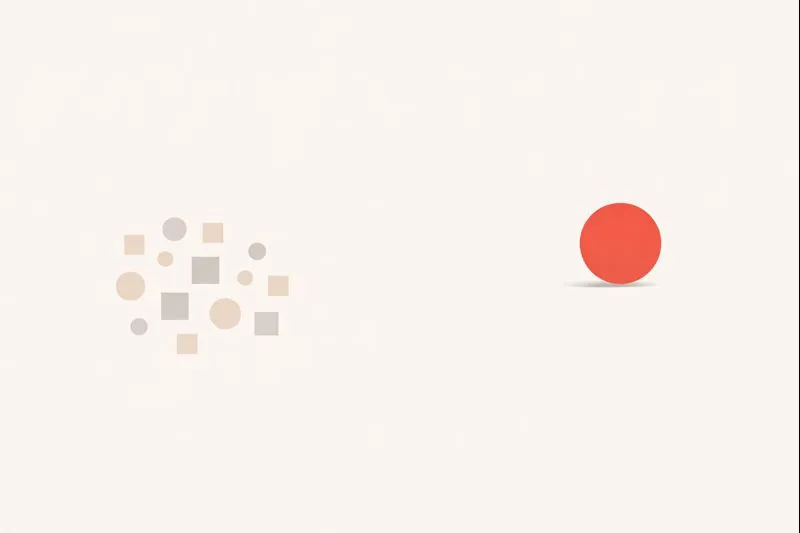
Emphasis is the part of a design that catches attention first. It’s often created by contrast in size, color, value, texture, shape, or focus.
Ways to create emphasis:
- Contrast (light/dark, warm/cool)
- Scale (big versus small)
- Isolation (one element separated)
- Sharpness (in focus versus soft)
How it works in practice:
Emphasis creates hierarchy. When multiple contrasts point to the same element, the viewer’s attention becomes effortless and immediate. Without emphasis, a design feels confusing because everything competes equally. Good emphasis makes the message obvious in seconds.
MOVEMENT
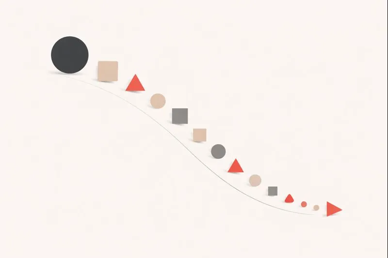
Movement is how a design leads the viewer’s eye through the composition. It can be created using lines, shapes, repeated forms, and directional cues.
Ways to create movement:
- Diagonal lines and curves
- Repetition that suggests direction
- Implied motion through pose or gaze
- Alignment pathways
How it works in practice:
Movement controls reading order. You can direct attention from headline to image to call-to-action just by aligning elements and using directional cues. Strong movement keeps the viewer engaged and reduces the chance they “drop off” visually before reaching the important part.
PATTERN & REPETITION
Pattern is the organized repetition of elements. Repetition creates consistency and strengthens visual structure.
Common uses:
- Decorative motifs (backgrounds, textiles)
- Grid-based layouts (UI and editorial)
- Repeated components for clarity
How it works in practice:
Repetition makes designs predictable, and predictability improves usability. In interfaces, repeating components reduces learning effort and increases speed. In visual compositions, repetition can create unity and rhythm, as long as you introduce enough variation to avoid boredom.
RHYTHM
Rhythm is the visual beat created by repeating elements with variation. It can feel steady, flowing, or energetic depending on spacing and pattern changes.
Types of rhythm:
- Regular rhythm: consistent spacing and repetition
- Alternating rhythm: repeating with a back-and-forth change
- Progressive rhythm: repetition that changes gradually
How it works in practice:
Rhythm keeps the eye moving in a controlled way. Regular rhythm feels calm and organized. Alternating rhythm adds contrast and energy. Progressive rhythm creates direction, which is useful when you want to guide attention across a layout or show progression.
PROPORTION
Proportion refers to the size relationships between parts of a composition. Good proportion helps designs feel intentional and readable.
Common proportion ideas:
- Large elements signal importance
- Consistent proportions improve coherence
- Extreme proportion changes create drama
How it works in practice:
Proportion is a silent ranking system. When sizes match importance, people understand what to read first and what can wait. Poor proportion makes layouts feel noisy and forces viewers to work harder. In practical design, proportion is one of the simplest ways to improve clarity fast.
VARIETY
Variety is the use of differences to create interest. It prevents repetition from becoming boring and helps highlight meaning.
Ways to add variety:
- Mix shapes (geometric and organic)
- Use multiple weights and textures
- Vary scale or color intentionally
How it works in practice:
Variety creates energy and personality. The key is intentional contrast. Add variety to support hierarchy, meaning, or mood, not to decorate randomly. One strong accent (color, shape, or texture) can create variety while still keeping the design controlled.
UNITY
When a design feels like a single, coherent piece, you’re seeing unity at work. Unity happens when elements look consistent and connected, so nothing feels out of place.
Ways to create unity:
- Consistent color palette
- Repeated visual language (icons, shapes, type)
- Alignment and grid structure
- Clear hierarchy and spacing
How it works in practice:
Unity is what makes a design feel professional. Even when there’s variety, shared choices like consistent spacing, typography, and a limited palette tie everything together. Unity also improves usability because viewers don’t have to relearn the design language from section to section.
Learn more about: Explain How Design is Important to the Content
Conclusion
The elements and principles of design are not rules meant to restrict creativity. They are tools that help you build visuals that are both beautiful and functional. Elements are the building blocks (line, shape, form, color, value, space, texture). Principles are how those blocks are arranged and experienced (balance, emphasis, movement, pattern, rhythm, proportion, variety, unity).
Once you learn to spot these fundamentals in real visuals, you gain control over clarity, mood, hierarchy, and usability. Apply them deliberately, and your work becomes easier to understand, more consistent, and much more effective.
Learn more about: nielsen norman group 10 usability heuristics for user interface design