

Human Factors Design is the practice of creating products, systems, and environments that fit real human abilities and limits so people can use them safely, efficiently, and comfortably. In plain terms, it is about making things work with people, not against them.
If you have ever yanked on a “pull” door that was actually a “push,” struggled to set a thermostat, or needed scissors to open “easy open” packaging, you have felt the cost of getting this wrong. Those moments feel like user error, but based on experience in the field, they are almost always design failures, not human failures. This article explains why designing for humans is so difficult in practice—and how to build a concrete, repeatable approach to do it better.
Learn more about:Approach Graphic in UX Design
TL;DR — Key Points
- Human-centered design is hard because humans are variable, distracted, biased, and often nothing like your design team.
- Good ergonomics, cognitive design, and UX must work together; treating them as silos leads to failure.
- You can reduce risk by following clear principles: fit the body, respect attention limits, design for error, and test in real contexts.
- Practical checklists keep teams honest when deadlines and feature creep push usability to the side.
- Iterative research and testing with real users is the only reliable way to uncover and fix hidden issues before launch.
What Is Human Factors Design, Really?
How do experts define it and why does it matter?
In professional practice, this discipline focuses on aligning products with human physical, cognitive, and emotional characteristics so people can achieve their goals with minimal effort and risk. The goal is not just “ease of use,” but a balance of safety, performance, comfort, and satisfaction across many different users and contexts. According to human factors research, even small mismatches—like button size or label wording—can dramatically change error rates and task time.
To do this well, you must start with a clear understanding of who your users are, what they are trying to do, and where they are doing it. That means real user research: interviews, contextual observation, and data on anthropometrics (body dimensions), vision, strength, and even cultural expectations. In practice, the best teams treat user data as a design input on par with technical specs and business requirements, not as a “nice to have” after the design is mostly done.
What makes this different from just “good design”?
From an expert standpoint, the difference is that this field is explicitly grounded in human science—psychology, biomechanics, physiology, and behavior. Instead of guessing, you use known limits, like how many items people can hold in working memory or how far most hands can comfortably reach. Industry standards in medical devices, aviation, and automotive all embed these principles because the cost of getting them wrong is measured in injuries and fatalities, not just bad reviews.
In everyday product work, the same thinking applies, even if the stakes are lower. A consumer device that ignores human limits may not cause harm, but it will generate support calls, returns, and brand damage. In my experience, the products that “just feel right” almost always come from teams that made human constraints a hard requirement, not a subjective preference.
Why Is Human Factors So Critical in Modern Product Design?
How does it impact usability, safety, and accessibility?
Considering human capabilities from the start is critical because people rarely read instructions, often use products in a hurry, and bring their own habits and assumptions. Research shows that users blame themselves for about 90% of errors, even when the interface is objectively confusing. That self-blame might hide your design flaws in the short term, but it erodes trust and loyalty over time.
When you account for diverse users—including older adults, people with disabilities, and those using your product in stressful conditions—you make systems that are more robust for everyone. Larger touch targets, higher contrast, and clear feedback help users with low vision, but they also help a nurse working in a dim ICU or a driver glancing at a dashboard. Based on experience, accessibility improvements are almost always general usability improvements.
How does it affect business outcomes and risk?
From a business perspective, getting this wrong is expensive. Poorly designed products lead to training costs, longer onboarding, higher support volume, and in regulated industries, more reportable incidents and recalls. According to industry data, fixing usability issues after launch can cost 10–100 times more than addressing them during concept and prototyping.
Conversely, products that respect human limits typically see higher adoption and fewer errors, which directly impacts revenue and reputation. I have seen teams cut support calls in half simply by redesigning a confusing workflow and clarifying feedback messages—no new features, just better alignment with how people actually think and behave.
How Do Human Factors, Ergonomics, and UX Fit Together?
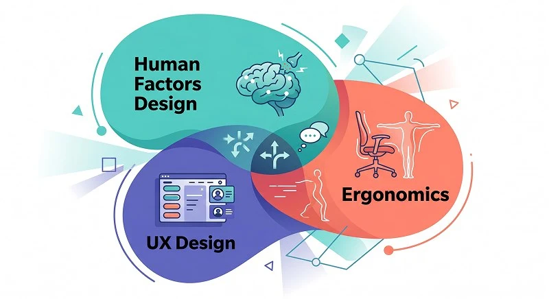
What is the difference between these commonly confused terms?
These terms are often used interchangeably, but they focus on different layers of the same problem and work best in combination. Think of them as overlapping lenses you can use to inspect a design. If you only use one, you will miss critical issues that appear in the others.
- Human factors: Broad discipline that covers physical, cognitive, and organizational aspects of how people interact with systems; used heavily in safety-critical domains like aviation and healthcare.
- Ergonomics: Subset focused on physical fit and comfort—posture, reach, force, and repetitive motion; for example, designing a handheld scanner that does not strain the wrist after hours of use.
- User experience (UX): Focused on the end-to-end journey, interactions, and emotions across all touchpoints; for example, how a patient discovers, sets up, and uses a home medical device over months.
Why does it matter to separate these disciplines in practice?
In real projects, problems rarely sit neatly in one box. A medical pump might be ergonomically comfortable to hold but cognitively confusing to program and emotionally intimidating for patients. If you only run an “ergonomic check,” you might ship a device that passes lab tests but fails in home use because the mental model is wrong.
By consciously combining these perspectives, you increase your odds of catching issues early. In one project, for example, a client’s industrial tool had great ergonomics but a poor UX flow; technicians kept skipping a critical safety step. Reworking the sequence and feedback—classic cognitive and UX work—cut the error rate dramatically without changing the physical form.
Learn more about: Figma Version Control for Design System
What Principles Make Human-Centered Design More Reliable?
Which core principles should every product team use?
Over time, several recurring principles have proven reliable in reducing errors and frustration across many domains. You do not need a PhD to apply them, but you do need discipline to check each one as you iterate. The following four are a practical minimum that I use on almost every project.
- Fit the body, not the average
Design for a range of users (often 5th to 95th percentile in height, reach, and strength) instead of a mythical “average” person. This means checking control placement, grip sizes, and required force against real anthropometric data. For example, a handheld device that only feels comfortable for large male hands will quickly fail in a mixed-gender workforce. - Respect cognitive limits
People can only hold a few items in working memory and are easily distracted, especially under stress. Keep interfaces simple, group related actions, and avoid forcing users to remember information from one screen to the next. In practice, reducing a medical device setup from eight steps to four, with clear on-screen guidance, often cuts training time and setup errors. - Design for error, not perfection
Assume users will press the wrong button, misread a label, or perform steps out of order. Good design makes errors easy to detect, easy to recover from, and hard to make catastrophic. A common real-world example is the confirmation screen before deleting data, which is much safer when it clearly states what will be lost in plain language. - Provide clear, timely feedback
Every action should have an immediate, understandable response—visual, auditory, or tactile. Vague or delayed feedback forces users to guess, which increases anxiety and repeated actions (“button mashing”). In one industrial interface redesign, simply adding distinct sounds and color changes for “command received” versus “command completed” reduced repeated inputs and system jams.
How do these principles play out in real projects?
In practice, we often see that teams apply one or two principles and skip the rest due to time pressure. For example, a consumer electronics company might nail the physical ergonomics of a remote but overload the interface with tiny, similar buttons. When we mapped usage patterns and applied cognitive load and error-tolerance principles, we removed low-value buttons, grouped functions, and introduced distinct shapes for critical controls, which made the device easier to use without increasing cost.
The key is to treat these principles as a checklist to revisit at each design milestone, not as a one-time workshop exercise. When you challenge every new feature and change against them, you prevent “design drift,” where well-intentioned additions slowly make the product harder to use.
What Practical Factors Should You Check During Design?
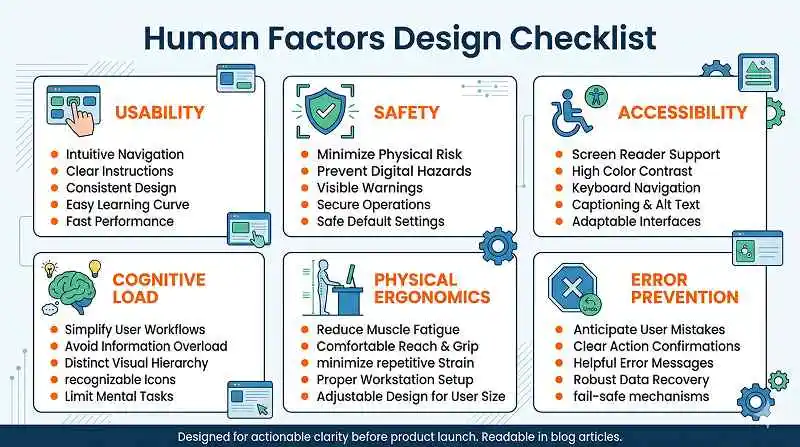
Which concrete considerations reduce risk before launch?
To make these ideas actionable, it helps to translate them into a short list of practical questions you can apply to any product. In reviews, I often walk teams through the following lenses and capture specific risks and mitigations for each. This turns abstract “user-centered” intentions into concrete design decisions.
- Physical use: Who is holding, lifting, or wearing this, and for how long? Are reach, grip, and force requirements acceptable for your smallest and weakest users?
- Cognitive demands: How many steps, decisions, and options does a typical task involve? Can users complete it without reading a manual every time?
- Environment and context: Will this be used in noise, low light, vibration, or with gloves? Does the design still work under those conditions?
- User diversity: How does the product perform for left-handed users, older adults, people with low vision, or limited dexterity?
- Failure modes: What happens when users skip a step, lose power, or get interrupted mid-task?
How can teams integrate this into everyday workflows?
The most effective teams bake these checks into existing processes instead of treating them as extra work. For example, add a “human factors” section to design review templates and require evidence—photos from field visits, test videos, or user quotes—to back up decisions. In agile environments, you can tag stories with specific usability risks and track them like any other technical debt.
Worth noting: not every product needs exhaustive analysis for every factor, especially in early-stage startups. However, even a lightweight checklist review can reveal high-risk assumptions, like expecting users to remember complex codes or perform fine motor tasks on the move. Catching those early saves both time and reputation later.
Lear more about: Explain How Design Is Important to the Content
How Do You Identify and Fix Human Factors Issues in Practice?
Which methods reliably uncover real user problems?
The only reliable way to uncover many human-related issues is to watch real people use your product in realistic conditions. According to usability research, even 5–8 participants in well-structured tests can reveal the majority of serious problems. The key is to combine several complementary methods rather than relying on a single survey or demo.
- Contextual inquiry: Observe users in their actual environment to see workarounds, distractions, and constraints you would never imagine in the lab.
- Usability testing: Give users realistic tasks and watch where they hesitate, ask questions, or make errors; measure time, error rates, and subjective frustration.
- Rapid prototyping: Build low- to mid-fidelity models (paper, foam, clickable prototypes) to test early and often before you lock in tooling or code.
- Heuristic and expert reviews: Have trained specialists walk through the design using established principles to catch issues that might not surface in small tests.
How do you turn findings into better design?
The most important step after testing is structured synthesis and iteration. Cluster issues by severity and frequency, then map them back to root causes such as unclear affordances, excessive steps, or poor layout. In practice, I recommend focusing first on problems that are both high-severity and easy to fix—label clarity, button grouping, feedback messages—because they deliver quick wins and build stakeholder confidence.
Then, for deeper structural issues, plan redesign cycles and retest with new users to confirm that you have truly solved the problems and not just shifted them. Over time, this iterative loop—observe, hypothesize, redesign, retest—builds an internal library of patterns that your team can reuse, making each new product more aligned with human realities than the last.
Create User-Centric Designs With a Human Factors Mindset
How can you start improving your designs today?
Applying the principles and methods from this field helps you move from “users will figure it out” to “this product actively supports people in doing their work well.” When you treat human constraints as hard requirements, you reduce errors, training time, and frustration while increasing trust and adoption. Even small changes—like clearer feedback, better grouping of controls, or designing for a wider range of body sizes—can have outsized impact.
Based on experience, the most successful teams are those that make this mindset part of their culture, not just a single project initiative. They bring real users into the process early, review designs through human, not just technical, lenses, and accept that iteration is cheaper than field failures. If you start with a simple checklist, run a few focused usability tests, and commit to revisiting key principles at every milestone, you will already be ahead of most organizations—and much closer to products that truly work for the people who rely on them.
Learn more about: Can Prompting be Used to Create Screens in Figma