

Translating goals into HEART dimensions in digital products is a structured way to turn vague ambitions like “better UX” or “higher engagement” into concrete, trackable metrics that teams can align on. Instead of guessing what to measure, you use the HEART framework to connect user and business goals to signals and numbers that actually reflect experience.
TL;DR
- The HEART framework (Happiness, Engagement, Adoption, Retention, Task Success) helps you measure UX quality in a user‑centric way.
- You start from product goals, then map them into relevant HEART dimensions before choosing metrics.
- The core pattern is Goal → Signal → Metric, not “pick metrics first”.
- A step‑by‑step process keeps designers, PMs, engineers, and data teams aligned on what success means.
- Even big teams (e.g., Google) use this model to make UX decisions that also move business outcomes.
Learn more about: Gestalt Principle of Continuity
What Is the HEART Framework and Why Does It Matter?
Understanding HEART in the context of modern product teams
The HEART framework is a UX measurement model created by Google researchers Kerry Rodden, Hilary Hutchinson, and Xin Fu to help teams evaluate user experience at scale. In practice, it gives you a language to discuss UX quality that goes beyond aesthetics and opinions, and that’s exactly what you need when translating goals into HEART dimensions in digital products. Instead of endless debates about “good design”, teams can talk about Happiness, Engagement, and other shared dimensions.
In today’s product landscape, we already have multiple frameworks to measure performance: AARRR (Pirate Metrics) for growth funnels, North Star Metric for strategic focus, Lean Analytics for startup stages, and Google’s GIST model for execution. Those are powerful, but they often lean heavily toward business outcomes and growth. HEART fills the gap by putting the user experience itself at the center of measurement, without losing connection to business impact.
From my experience working with SaaS, marketplace, and consumer apps, HEART is especially useful when a product is already live and you need to improve or scale the UX. It shines when you have enough traffic or usage data to measure behavior, but you still want qualitative nuance. It is less about early product‑market fit and more about ensuring that your existing users are genuinely successful and satisfied.
How HEART breaks UX into measurable dimensions
HEART is an acronym that breaks UX into five measurable dimensions:
- Happiness – User attitudes and perceptions.
- Engagement – Frequency, depth, and intensity of usage.
- Adoption – New users or new feature uptake.
- Retention – Continued usage over time.
- Task Success – Efficiency and effectiveness of completing key tasks.
Each dimension gives a different lens on the same product. According to industry practice, high‑performing teams rarely track all five for every initiative; they pick the 2–3 that best match their goals. This selective focus is crucial: trying to optimize everything at once typically leads to noisy dashboards and weak insight.
When you combine these dimensions intentionally, you get a balanced view of UX that connects human needs (Are people happy? Can they succeed?) with business realities (Do they stay? Do they adopt new features?). That balance is what makes HEART particularly effective compared to purely growth‑focused frameworks.
How Do the HEART Dimensions Work in Detail?
1. Happiness: Are users satisfied and willing to recommend?
Happiness measures how users feel about your product: satisfaction, perceived usefulness, and likelihood to recommend. In practice, this is the dimension you use when your goal is to improve perceived quality, trust, or brand affinity. Based on past projects, we typically focus on this when redesigning key flows, launching a major UI overhaul, or addressing known UX pain points.
Common metrics for Happiness include:
- CSAT (Customer Satisfaction Score) after key flows.
- NPS (Net Promoter Score) at product or feature level.
- App store ratings and review sentiment.
- Post‑task “ease of use” ratings in usability studies.
2. Engagement: How often and how deeply do users interact?
Engagement captures how frequently and intensively users interact with your product or specific features. This is the go‑to dimension when your goal is to increase active usage, depth of use, or feature discovery. In digital products like to‑do apps or collaboration tools, engagement often correlates with perceived value, but you must still watch for unhealthy patterns (e.g., doom‑scrolling).
Common metrics for Engagement include:
- Daily/weekly/monthly active users (DAU/WAU/MAU).
- Session length and sessions per user.
- Feature usage rate (e.g., % of users using search or filters).
- Number of key actions per session (e.g., tasks created, messages sent).
3. Adoption: How many users start using the product or feature?
Adoption tracks new users for a product or new users of a specific feature. This dimension is critical when you launch something new and need to see if people are actually trying it. In my experience, teams often confuse “shipped” with “adopted”; Adoption metrics quickly reveal when a feature is invisible or poorly communicated.
Common metrics for Adoption include:
- Number and % of users who try a new feature at least once.
- New account sign‑ups for a product or plan.
- Activation rate (users passing a defined “first value” milestone).
- Opt‑in rates for new capabilities (e.g., enabling notifications).
4. Retention: Do users come back and keep using it?
Retention measures how many users continue using your product or feature over time. This is where HEART overlaps strongly with business outcomes, because retention is a key driver of LTV and revenue. According to most SaaS benchmarks, improving retention by just a few percentage points often has more impact than chasing new sign‑ups.
Common metrics for Retention include:
- Cohort‑based retention (e.g., % of users active after 1, 4, 12 weeks).
- Churn rate (user or account churn).
- Revisit rate for specific features or content types.
- Subscription renewal rates or plan downgrade rates.
5. Task Success: Can users complete key tasks efficiently?
Task Success evaluates whether users can complete important tasks, how long it takes, and how many errors they encounter. This dimension is essential when optimizing flows like onboarding, checkout, or publishing content. In usability studies, this is usually the primary dimension you track.
Common metrics for Task Success include:
- Task completion rate (% of users who finish the flow).
- Time on task (median or 90th percentile).
- Error rate or backtrack rate.
- Number of help requests or support tickets per task.
When combined, these five dimensions help your team design a measurement strategy that is both data‑driven and deeply human‑centered. Instead of chasing vanity metrics, you can intentionally decide which aspects of the experience matter most for a given initiative and measure those with rigor.
Learn More about: User Centered Design UCD Process
How Do You Start Translating Goals into HEART Dimensions?

Why you must start from goals, not from metrics
Setting up meaningful UX metrics is not about picking numbers you can easily track; it’s about translating goals into HEART dimensions in digital products in a way that reflects both user value and business value. Our philosophy in product teams is simple: we never start from metrics; we start from meaning. Only after we understand what success looks like for users and for the business do we choose the right dimension and metric.
This approach follows the well‑known pattern from the original Google HEART paper: Goals → Signals → Metrics. Goals describe the desired change in user behavior or attitude, signals describe observable evidence that the goal is happening, and metrics are the specific, quantifiable measures of those signals. Skipping straight to metrics is a common anti‑pattern that leads to dashboards no one trusts.
From experience, the most effective teams also constrain scope early. They pick a specific product area or flow, agree on 1–2 primary HEART dimensions for that area, and only then define goals. This focus keeps the framework practical instead of turning it into an academic exercise.
Step 1: Identify the product area or feature
The first step is to pick a concrete area of your product to work on, not “the whole app”. This could be:
- Onboarding flow for new users.
- Search and filter experience in a marketplace.
- Messaging in a collaboration tool.
- Dashboard in an analytics product.
By narrowing scope, you make it easier to have crisp goals and clean signals. For example, “improve onboarding” is far more manageable than “improve UX everywhere”. In practice, we often start with flows that have clear business impact and visible user pain, such as checkout or activation.
Step 2: Choose the most relevant HEART dimensions
Once you have a focus area, choose 1–3 HEART dimensions that best match the type of improvement you want. You do not need all five for every initiative; over‑instrumentation just creates noise.
Some common patterns:
- Onboarding: Adoption, Task Success, early Retention.
- Core engagement features (e.g., timeline, dashboard): Engagement, Retention, sometimes Happiness.
- New feature launch: Adoption, Engagement, Happiness.
- Checkout or payment flow: Task Success, Happiness (trust), downstream Retention.
This is the moment where you are effectively mapping your high‑level product goals into HEART. For example, a goal like “more users complete onboarding and come back next week” naturally maps into Adoption, Task Success, and Retention.
What Is the Step‑by‑Step Process to Map Goals → Signals → Metrics?
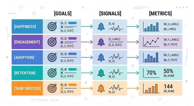
Step 3: Define user‑centered goals for the chosen area
With the area and dimensions selected, you now articulate explicit, user‑centered goals. These are statements about what should be better for users, phrased in plain language, not in metric terms.
Examples:
- Onboarding (Adoption, Task Success): “New users can set up their first project in under 10 minutes without needing help.”
- Search (Task Success, Happiness): “Users can reliably find relevant items in the first page of results and feel confident about their choice.”
- Messaging (Engagement, Retention): “Teams use channels daily to coordinate work, instead of relying on external tools.”
These goals should satisfy both user needs and business goals. For instance, faster onboarding reduces drop‑off (business) and reduces frustration (user). According to best practices, you should validate these goals with stakeholders early so everyone agrees on what “good” looks like.
Step 4: Translate each goal into signals, then into metrics
Now you apply the core pattern: Goal → Signal → Metric. Signals are behaviors or attitudes you can observe that indicate the goal is being met. Metrics are how you quantify those signals.
Example 1 – Onboarding in a SaaS tool:
- Goal (Task Success, Adoption): “New users can set up their first project in under 10 minutes without needing help.”
- Signals:
- Users complete the “Create first project” flow.
- They do not abandon the flow midway.
- They do not contact support during onboarding.
- Metrics:
- Task completion rate for “Create first project”.
- Median time to complete first project setup.
- % of new users who contact support during first session.
Example 2 – Messaging feature in a collaboration app:
- Goal (Engagement, Retention): “Teams use channels daily to coordinate work.”
- Signals:
- Users send messages in channels regularly.
- Multiple team members participate in the same channel.
- Teams return to channels over multiple weeks.
- Metrics:
- Messages sent per active user per day.
- % of channels with more than 3 active members.
- 4‑week channel retention rate (channels with activity each week).
In practice, we usually brainstorm several possible signals, then pick the ones we can measure reliably with existing instrumentation. It’s better to have a slightly imperfect but trackable metric than a theoretically ideal one that requires months of data engineering.
Step 5: Align metrics with cross‑functional stakeholders
Finally, you align with PMs, engineers, data analysts, and leadership on the selected goals, signals, and metrics. This alignment step is where HEART becomes a bridge between UX and business, not just a UX exercise.
Key activities in this step:
- Review whether metrics are technically feasible and unambiguous.
- Check that at least some metrics connect to business outcomes (e.g., retention, revenue, cost‑to‑serve).
- Agree on baselines and target ranges (e.g., improve task completion from 65% to 85% in one quarter).
- Decide where and how these metrics will be monitored (dashboards, regular reviews, etc.).
Based on experience, the most common failure mode here is teams tracking HEART metrics in isolation, without linking them to business KPIs. To avoid this, explicitly map each HEART metric to an expected business impact, even if it’s indirect (e.g., higher task success → fewer support tickets → lower support costs).
Learn more about: What Colors Easily Manipulate Poeple
Real‑World Example: How Could a Company Apply HEART to a New Feature?
Scenario: A collaboration tool launches a new “Project Overview” dashboard
Imagine a mid‑size B2B collaboration platform launching a new “Project Overview” dashboard to help teams track tasks, deadlines, and owners in one place. The product team wants to ensure the feature not only looks good but also drives real value. They decide to use the HEART framework, with UX research leading the effort and data science supporting instrumentation.
The team’s high‑level goal is to make it easier for project leads to understand project health at a glance and take action quickly. To operationalize this, they focus on translating goals into HEART dimensions in digital products, specifically selecting Engagement, Task Success, and Happiness for this feature. Adoption and Retention will be monitored at a higher, product‑level view.
Here’s how they break it down:
HEART dimensions applied to the Project Overview dashboard
Happiness
- Signal & Metric:
- In‑context CSAT survey after 2 weeks of usage asking “How satisfied are you with the Project Overview dashboard?” (1–5 scale).
- App‑wide NPS segmented by users who actively use the dashboard vs. those who don’t.
- Outcome:
- They discover that dashboard users report significantly higher satisfaction with “visibility into project status”, guiding further investment into this area.
Engagement
- Signal & Metric:
- % of active project leads who visit the dashboard at least 3 times per week.
- Average time spent on the dashboard per session (excluding idle time).
- Number of key interactions (e.g., tasks reassigned, due dates updated) per visit.
- Outcome:
- Initial data shows many views but few interactions. The team learns that users see the dashboard as a “read‑only report” and prioritize improving inline editing and quick actions.
Adoption
- Signal & Metric:
- % of eligible workspaces with at least one dashboard visit in the first month.
- % of project leads who open the dashboard at least once after receiving in‑app education.
- Outcome:
- Adoption is strong among new customers but weak among older ones. This leads to a targeted campaign and contextual nudges for existing accounts.
Retention
- Signal & Metric:
- 8‑week feature retention: % of project leads who continue to use the dashboard weekly.
- Workspace‑level retention: workspaces with active projects that use the dashboard vs. those that don’t.
- Outcome:
- Workspaces using the dashboard show higher overall product retention, strengthening the case to make the dashboard a central part of the experience.
Task Success
- Signal & Metric:
- Task completion rate for “identify overdue tasks and assign owners” during usability testing.
- Time to first actionable insight (from opening the dashboard to making a change).
- Error or backtrack rate when trying to update task details from the dashboard.
- Outcome:
- Usability sessions reveal that users struggle to understand filters, causing slow task completion. The team simplifies filters and improves empty‑state messaging, which later improves both task success and engagement metrics.
This example illustrates how a team can start from a strategic goal (“help project leads understand and act on project health”) and systematically derive HEART‑aligned metrics. Over time, they correlate improvements in these metrics with reduced support tickets and better customer retention, closing the loop between UX and business impact.
How Should You Get Started with HEART in Your Own Product?
Start small, stay focused, and iterate
To start applying this in your own context, pick a single flow or feature with clear business relevance and user pain. Then walk through the steps: define the area, pick 1–3 HEART dimensions, articulate user‑centered goals, derive signals and metrics, and align with your cross‑functional team. This is the most practical way to begin translating goals into HEART dimensions in digital products without overwhelming your organization.
In practice, you don’t need a big overhaul to see value. Even one well‑designed HEART dashboard for a critical flow like onboarding or checkout can change how your team talks about UX. Instead of “I feel this design is better”, discussions shift to “this variant improved task success and early retention by X%”. That shift builds trust in UX and creates a shared language across disciplines.
As you gain confidence, you can expand HEART coverage to more areas and refine metrics based on what you learn. Always remember the core principle: start from meaning, then move to measurement. When you let user and business goals drive your HEART dimensions, you get a measurement system that is not only rigorous, but also genuinely useful for building better digital products.