

Hierarchical task analysis is a structured method for breaking a user goal into smaller and smaller steps so you can see exactly how people actually complete a task in the real world. In UX work, we use it to map goals, sub-goals, decisions, and actions in a tree-like diagram that exposes friction, hidden complexity, and design opportunities.
Learn more about: Example of The Problem Statement
TL;DR — Key Takeaways
- It is a way of decomposing a user goal into a hierarchy of sub-tasks, plans, and actions.
- UX teams love it because it uncovers edge cases, cognitive load, and unnecessary steps that usability tests often miss.
- You can build one from field observations, interviews, analytics, or a mix of qualitative and quantitative data.
- The outputs guide information architecture, interface flows, content strategy, and even training and support materials.
- Done well, it becomes a living reference that aligns product, design, engineering, and stakeholders on what the task really involves.
What Exactly Is Hierarchical Task Analysis in UX?
A plain-English definition you can actually use
In UX practice, hierarchical task analysis is a modeling technique where you take a user’s main goal and systematically break it into sub-goals, operations, and decision points until each step is concrete enough that you could watch someone do it. Think of it as zooming in from “Book a flight” all the way down to “Enter last name in passenger form field.”
According to human factors research, this approach came from safety-critical domains like aviation and healthcare, where understanding every tiny step is literally life-or-death. When we borrow it for digital products, we get a disciplined way to map what users need to do, not just what our interface currently offers. Based on experience, the most valuable insights usually come from the “in-between” steps users take outside your product: checking email, finding a confirmation code, asking a coworker, or scribbling notes.
A typical model includes:
- A top-level goal (e.g., “Submit an expense report”).
- Ordered sub-tasks (e.g., “Collect receipts,” “Enter details,” “Submit for approval”).
- A “plan” line that states the logic for sequencing sub-tasks (e.g., “Do 1–3 in order, repeat 2 for each receipt”).
- Branches for decision points and alternative paths.
Once you see the full tree, it becomes obvious where users stumble, where they repeat work, and which steps your UI never actually supports.
How it differs from simple task lists and user flows
This method goes deeper than a basic task list or a happy-path flowchart. A task list might say “Sign up → Verify email → Log in,” but a rigorous breakdown shows the real work: searching inbox, dealing with spam filters, copying codes, switching devices, and recovering when the code expires.
User flows usually focus on screens and states inside your product. By contrast, this analysis is interface-agnostic: it cares about what humans are trying to accomplish, whether they’re in your app, in another tool, or offline. In practice, I often run into teams that design flows first and then retrofit them onto user behavior; this technique flips that order so the flow emerges from actual behavior.
Another key distinction is granularity. You stop decomposing only when further detail no longer helps design decisions. For a medical device, you might go down to hand movements; for a consumer app, you might stop at “Enter payment details.” The trick is to choose a depth that matches the risk, complexity, and business value of the task.
Why UX teams keep coming back to this tool
UX teams are obsessed with this method because it gives them a shared, evidence-based picture of how tasks really unfold. It’s not a vague persona or a fluffy journey map; it’s a precise operational breakdown you can argue about, test, and improve.
Research shows that complex workflows often hide 20–50% “invisible work” that product teams never design for—things like workarounds, note-taking, and cross-checking between systems. This method surfaces that invisible work. Once you see it, you can:
- Remove redundant steps.
- Automate tedious ones.
- Add guidance where people make predictable mistakes.
- Clarify responsibilities between user, system, and other actors.
Over time, that leads to lower error rates, faster completion times, and fewer support tickets—outcomes stakeholders actually care about.
How Do You Actually Build One Step by Step?
Start with the right task, the right users, and the right scope
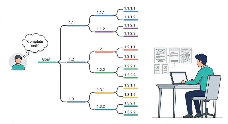
You build a hierarchical task analysis by first choosing a single, clearly defined user goal that is important, frequent, or risky. In practice, I recommend picking a task that:
- Has measurable business impact (revenue, retention, cost to serve).
- Involves multiple tools or departments.
- Generates recurring user complaints or support volume.
Then you define whose task you are modeling. “Onboarding” looks very different for a first-time small business owner than for an IT admin rolling out your product to 500 employees. Scope creep is the biggest early failure mode; if your goal sounds like “Manage projects,” you need to narrow it down to something like “Create and publish a new project plan.”
Once you have a clear goal and user group, collect raw data. That can be contextual inquiries, screen recordings, usability tests, or diary studies. According to industry best practice, you should watch at least 5–8 real users perform the task in their own environment before you start formal modeling, because internal assumptions are almost always wrong on the first pass.
Learn more about Process User Experience
Decompose the task into sub-tasks, operations, and plans
Once you have data, you write the top-level goal in plain language, then break it into 4–8 major sub-tasks. Each sub-task should represent a meaningful chunk of work with a clear outcome. From there, you recursively decompose each sub-task into smaller units until each one is concrete, observable, and unambiguous.
For each set of sub-tasks, you write a “plan” statement that explains the order and conditions under which they happen. For example:
- “Plan: Do 1–3 in order; if the card is declined at 2.3, go to 4.”
- “Plan: Do 1 and 2 in parallel; when both are complete, do 3.”
This plan is where logic, branching, and loops live. Based on experience, this is also where teams discover that their product only supports the happy path and ignores real-world contingencies—like failed payments, partial data, or approvals that get stuck.
A common real-world example is expense reporting. When we modeled it for a large company, we discovered that the “Submit expense” step actually contained a loop where users repeatedly chased managers for approvals, edited line items, and re-uploaded receipts due to unclear rules. That loop never appeared in the original flowchart, but it dominated the lived experience.
Validate, refine, and turn the model into design decisions
After you draft the hierarchy, validate it with real users and cross-functional partners. Walk through the steps with participants and ask, “What’s missing?” and “What do you actually do here?” With engineers and operations folks, confirm system constraints and back-office steps you might have overlooked.
Then translate your findings into specific design moves:
- Combine or remove steps to simplify the flow.
- Add inline guidance or defaults where errors cluster.
- Reorder steps to match mental models (e.g., choose dates before asking for payment).
- Introduce bulk actions or templates where people repeat similar micro-tasks.
In practice, I like to annotate the model with pain points, metrics (time-on-step, error rates), and opportunity notes so it becomes a living design backlog, not just a documentation artifact.
Where Does the Data Come From, and How Deep Should You Go?
Mixing qualitative and quantitative inputs for a robust picture
The best hierarchical task analysis models combine qualitative observation with quantitative evidence. Qualitative data—interviews, shadowing, usability tests—explain why people behave as they do. Quantitative data—analytics, logs, time-on-task, funnel drop-offs—show where problems concentrate and how big they are.
According to experts in human factors, starting with qualitative fieldwork leads to more accurate task structures, because you see workarounds and context you would never infer from numbers alone. Then, you layer on data from analytics tools or product telemetry to prioritize which branches of the tree matter most. For example, if 70% of users abandon during “Upload document,” you know that branch deserves design attention.
There is also value in capturing environmental and organizational factors: policies, tools, regulations, and incentives. These often dictate why users follow a certain sequence, even when it seems irrational from a pure UX perspective. For regulated industries, documenting those constraints in your model can prevent you from proposing “solutions” that are legally impossible.
Learn more about: Secondary Market Research
Choosing the right level of detail for your context
How deep you go depends on risk, complexity, and design goals. For a consumer photo-sharing app, it might be enough to map 2–3 levels of depth (“Select photo → Edit → Share”). For an ICU medication workflow, you may need to document every verification, handoff, and physical action.
A useful rule of thumb from industry standards: stop breaking down a task when further detail would not change your design or safety decisions. If going from “Enter address” to “Type street name” and “Type city” does not affect your choices, you can keep it at the higher level. On the other hand, if mixing up “amount” and “currency” has serious financial consequences, you may want to separate and analyze those steps.
Worth noting: over-modeling is as risky as under-modeling. I’ve seen teams produce 30-page diagrams that nobody reads. Aim for a level of detail that stakeholders can grasp in a single working session while still exposing hidden complexity. You can always maintain a more detailed version for specialists, but your primary artifact should be digestible.
Handling variability, edge cases, and messy real life
Real tasks are rarely linear. People backtrack, skip steps, improvise, or use shortcuts. A sophisticated model embraces this variability rather than forcing everything into a single rigid path. You can:
- Create separate branches for novice vs. expert users.
- Show optional loops for troubleshooting or rework.
- Capture alternate paths for different tools or channels (mobile vs. desktop, self-service vs. assisted).
Research shows that edge cases often account for a disproportionate share of frustration and support load. Based on experience, the most impactful design improvements often come from better handling these “rare but painful” paths—like account recovery, failed imports, or compliance checks—rather than polishing the already-smooth happy path.
How Does This Method Connect to Flows, IA, and Interaction Design?
Turning the task hierarchy into flows and screen-level decisions
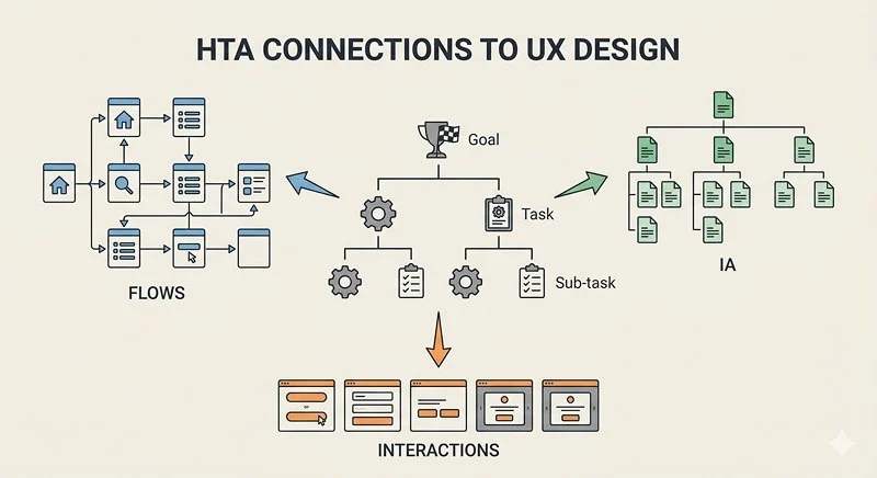
The hierarchy you build becomes the backbone for your user flows, information architecture, and interaction patterns. Instead of guessing which screens to design, you derive them from the sub-tasks and plans you already mapped. Each major sub-task often corresponds to a step, screen, or section in your product.
For instance, if your analysis shows that users mentally group “Choose plan” and “Estimate total cost” as one conceptual step, you might keep those on a single screen with dynamic pricing, rather than splitting them across a multi-step wizard. Conversely, if a sub-task is cognitively heavy—like configuring permissions—you might break it into smaller UI steps to reduce overwhelm.
The model also clarifies where system automation should step in. Any repeated or low-value micro-step (copying IDs, re-entering known data, checking formatting) is a candidate for auto-fill, defaults, or background processing. According to industry best practices, removing even 1–2 of these micro-frictions can measurably increase completion rates for complex flows.
Learn more about: Interaction Design
Aligning cross-functional teams around the real work
One of the underrated benefits of this method is alignment. Engineers, product managers, marketers, and operations people all see the task from their own angle. A shared hierarchical model gives them a neutral ground to discuss trade-offs, constraints, and responsibilities.
In workshops, I often print the model as a large poster or digital whiteboard and have each function annotate it with their concerns:
- Engineering adds technical dependencies and system limits.
- Support marks where tickets originate.
- Legal highlights compliance-sensitive steps.
- Marketing flags messaging or upsell moments.
This multi-perspective annotation turns the model into a decision map, not just a UX artifact. It becomes much easier to justify why you are investing in certain improvements and deferring others.
Using it to design content, training, and support
Because the hierarchy exposes where users hesitate or make mistakes, it’s a powerful guide for content strategy and enablement. You can place contextual help, tooltips, and documentation exactly where they map to confusing sub-tasks. If your model shows that users repeatedly pause to “Figure out which option applies to me,” that’s a perfect place for examples, decision trees, or guided setup.
The same is true for training and onboarding. Instead of generic walkthroughs, you can structure training around real tasks and their sub-steps. Support teams can also use the model as a diagnostic tool: when a user calls with a vague complaint, agents can walk through the hierarchy to quickly locate the likely failure point, which shortens handle time and improves resolution quality.
When Should You Use It—and What Are Its Limits?
High-value scenarios where this method shines
You should reach for hierarchical task analysis when the stakes or complexity are high enough that guessing is dangerous or expensive. Common scenarios include:
- Enterprise workflows with multiple roles and handoffs.
- Safety-critical or regulated tasks (finance, healthcare, aviation).
- Onboarding flows that strongly affect activation and retention.
- Migration or setup experiences with many dependencies.
In these contexts, small design mistakes can ripple into costly errors, compliance breaches, or churn. According to experts in usability engineering, structured task analysis can reduce critical error rates by 30–60% in complex systems when paired with iterative design and testing. That’s a level of impact you rarely get from cosmetic UI tweaks.
It’s also useful when redesigning legacy systems. Long-standing tools often accrete strange workarounds and tribal knowledge. Mapping the true task structure gives you a clean baseline to challenge assumptions, question legacy steps, and design a more modern, streamlined experience.
Situations where lighter-weight tools may be better
This method is not a hammer for every nail. For very simple, low-risk interactions—liking a post, setting a profile picture—a full hierarchical analysis may be overkill. A quick user flow, sketch, or guerrilla test might be enough.
It can also be too heavy for early discovery when you are still figuring out what the core task should be. In that phase, generative research, interviews, and journey mapping are usually more appropriate. Once you know which tasks matter, then you can bring in structured analysis.
Another limitation is that models can age quickly in fast-moving products. If your team ships weekly, you need a lightweight way to update the hierarchy or accept that it will be a snapshot, not a living document. Being honest about this limitation builds trust: you use the method where it adds real value, not as a performative deliverable.
Common mistakes and how to avoid them
Based on experience, teams most often stumble in three ways:
- Modeling the UI, not the human task. They simply redraw their existing screens in a tree. Fix this by starting from user goals and behavior, independent of your current interface.
- Ignoring context and offline steps. They only capture in-product actions. Fix this by observing users in their environment and explicitly asking, “What do you do before and after this?”
- Stopping before the painful detail. They stay at high level (“Upload document”) and miss the hard parts (finding the file, scanning, compressing, dealing with errors). Fix this by probing: “Walk me through exactly how you do that.”
If you avoid these traps, the technique becomes a sharp, reliable tool rather than busywork.
How Can You Start Using Hierarchical Task Analysis Tomorrow?
A simple starter workflow you can run this week
You can start small with one critical task and a lean process. Pick a single user goal, watch 5 people complete it, and sketch a rough hierarchy on a whiteboard. Don’t worry about perfect notation at first; aim for clarity and completeness.
Then, refine the model with your team in a 60–90 minute workshop. Ask:
- Where do users struggle?
- Which steps could we remove, automate, or better support?
- What assumptions are we making that the model challenges?
From that discussion, extract 3–5 concrete design or product changes and prioritize them. This tight loop—from observation to model to action—will quickly demonstrate the method’s value.
Once people see that the artifact leads directly to better decisions, you can formalize the practice: templates, notation standards, and integration into your design and research playbooks.
Making it part of your ongoing UX and product toolkit
Over time, hierarchical task analysis works best when it becomes a standard lens for thinking about work, not a one-off deliverable. You can:
- Use it to frame discovery for new features.
- Update models after major releases to keep them relevant.
- Pair them with journey maps, personas, and service blueprints.
- Attach them to design docs and RFCs so engineers see the rationale.
According to industry standards, teams that systematically combine structured task analysis with iterative usability testing see stronger gains in task completion and satisfaction than teams relying on intuition alone. The method doesn’t replace creativity; it channels it toward the parts of the experience that matter most.
Bringing it together: why this method is worth the effort
Hierarchical task analysis gives UX teams a disciplined way to see the full shape of user work—goals, sub-goals, decisions, and messy realities—so they can design experiences that actually fit how people think and act. It turns vague complaints (“Our onboarding is confusing”) into specific, solvable problems (“Users loop between steps 2.2 and 2.3 because they lack information X”).
Learn more about: Integrating AI Into Human Everyday Workflows