
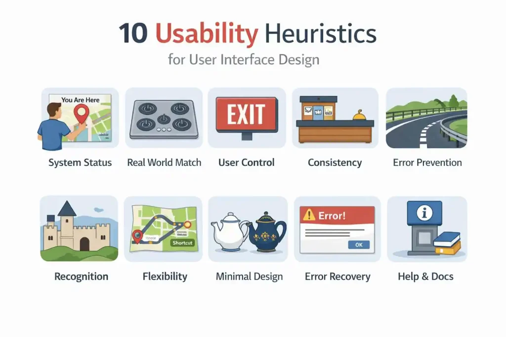
In the world of user interface (UI) design, creating seamless and intuitive experiences is a top priority. One of the most effective ways to ensure a design is user-friendly is by applying Jakob Nielsen’s 10 Usability Heuristics. Developed by Nielsen and the Nielsen Norman Group, these heuristics provide general rules of thumb that help designers create more intuitive, effective, and user-friendly interfaces. In this article, we will explore how to apply each of the 10 heuristics to improve your UI designs.
Learn more about: Elements and Principles of Design
1. Visibility of System Status

The first heuristic emphasizes the importance of keeping users informed about what’s happening in the system. Users should always know the status of the system, whether it’s loading, processing, or waiting for input. This can be done through clear feedback within a reasonable time frame.
How to Apply:
- Always provide immediate feedback after an action, such as a loading spinner or progress bar.
- Use clear indicators (like “You Are Here” on a map) to show users their current location or status in the process.
- Ensure the feedback is easy to understand and doesn’t keep the user guessing.
Example: A website might display a message like “Your order is being processed” immediately after a user clicks the “Submit” button.
2. Match Between the System and the Real World
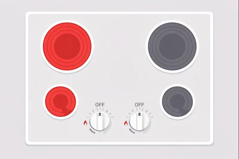
Design should speak the users’ language. Instead of using technical jargon, use words and concepts familiar to the user. The interface should follow real-world conventions and display information in a natural order.
How to Apply:
- Use familiar terminology that your target users understand.
- Ensure actions and elements are logically ordered, just like they would appear in real-world scenarios.
Example: A stovetop’s controls should match the arrangement of heating elements, making it easy for users to understand which control affects which burner.
3. User Control and Freedom

Users should be able to easily undo or redo their actions. Accidental actions should be reversible, and users should always feel they can freely navigate through the system without fear of making irreversible mistakes.
How to Apply:
- Include features like “Undo” and “Redo.”
- Provide clear exit options from a process, such as a “Cancel” button.
- Ensure that these exit options are easily discoverable and clearly labeled.
Example: In a form submission process, allow users to click “Cancel” to discard changes without completing the form.
4. Consistency and Standards

Users shouldn’t have to wonder whether different words or actions mean the same thing. Consistency helps users predict what will happen, reducing cognitive load and making interactions easier to understand.
How to Apply:
- Maintain consistency across different screens or pages.
- Follow industry standards and conventions (like placing the menu bar at the top of the page).
- Ensure that similar actions trigger similar results.
Example: The “Home” icon should always be the same across an app or website to avoid confusion.
5. Error Prevention

A good design prevents problems before they happen. By reducing error-prone conditions or providing users with warnings before they make irreversible mistakes, the likelihood of errors can be minimized.
How to Apply:
- Design with constraints that prevent common mistakes (e.g., limiting the number of characters for a password).
- Offer users confirmation options before taking irreversible actions.
- Support undo or cancel features to allow users to correct mistakes.
Example: A shopping cart might ask for a confirmation before a user deletes an item to prevent accidental removal.
6. Recognition Rather Than Recall

Minimize users’ cognitive load by making elements and actions visible or easily accessible. Users shouldn’t have to remember information from one part of the interface to another.
How to Apply:
- Keep labels, menu items, and options visible at all times, so users don’t need to recall them.
- Use icons and visuals that help users recognize their choices.
Example: In a file browser, show thumbnails of images or documents so users can recognize them quickly rather than remembering file names.
7. Flexibility and Efficiency of Use
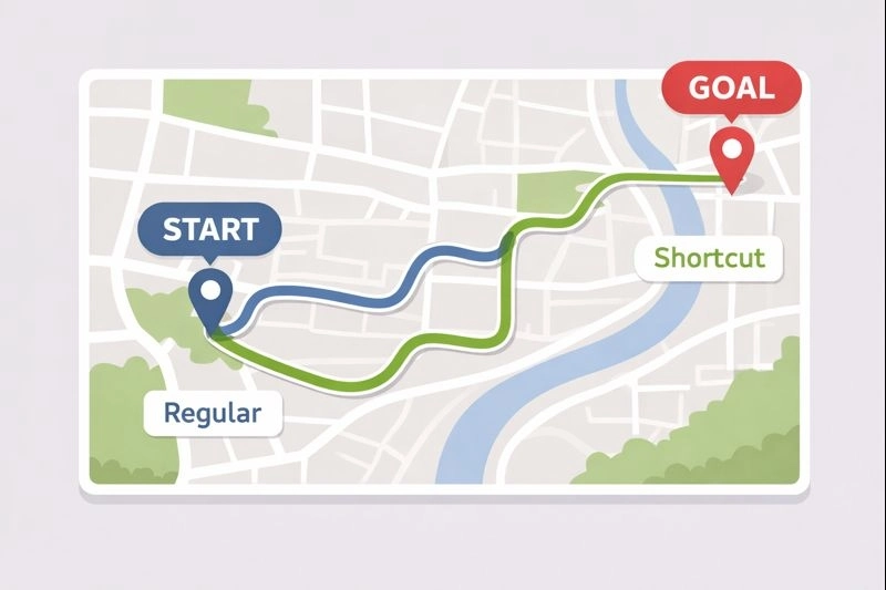
Designs should cater to both novice and expert users. While beginners should find the interface easy to navigate, advanced users should be able to perform tasks more efficiently with shortcuts or customized options.
How to Apply:
- Offer shortcuts (e.g., keyboard shortcuts) that allow expert users to speed up their tasks.
- Allow users to customize their interface for faster access to commonly used actions.
Example: Provide a search bar that auto-suggests results, but also allow power users to jump straight to their search results with a shortcut.
8. Aesthetic and Minimalist Design
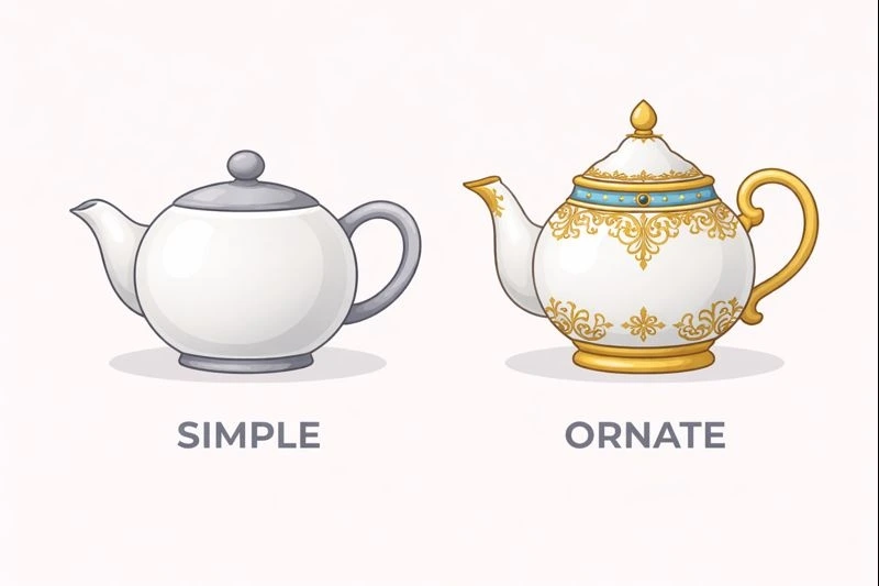
The design should not contain irrelevant or rarely needed information that could distract users. An aesthetic design focuses on the essentials, making sure that only important information is displayed.
How to Apply:
- Remove any unnecessary elements or decorations that do not contribute to the user’s goal.
- Focus on clear, visually appealing layouts that highlight key actions and content.
Example: A clean, minimalistic product page that focuses solely on product information, images, and an “Add to Cart” button without cluttering the interface with too much text.
9. Help Users Recognize, Diagnose, and Recover from Errors
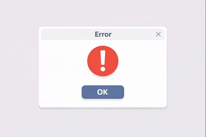
When users encounter an error, it should be presented in simple language without technical jargon. The system should indicate what went wrong and suggest how users can fix it.
How to Apply:
- Provide clear, concise error messages that tell users exactly what went wrong and how they can fix it.
- Use visual cues, like color and icons, to draw attention to the error.
Example: If a user enters an incorrect password, show an error message like, “The password you entered is incorrect. Please try again.”
10. Help and Documentation

While it’s best if the system doesn’t need documentation, sometimes users may need additional guidance. Make help content easy to find and focused on the user’s tasks.
How to Apply:
- Ensure that help or documentation is easy to search and access.
- Provide concise, actionable steps rather than lengthy explanations.
Example: Include a “Help” button that provides FAQs or step-by-step instructions for common issues.
Learn more about: Small Business Web Design and Management Services
Conclusion
By applying Jakob Nielsen’s 10 Usability Heuristics for User Interface Design, designers can create intuitive, efficient, and user-friendly interfaces that meet users’ needs and expectations. These heuristics offer a practical framework for improving usability, minimizing errors, and ensuring a smooth user experience across different platforms and devices. Keep in mind that these principles remain timeless, and incorporating them into your design process will help ensure your interfaces are both functional and pleasant to use.