
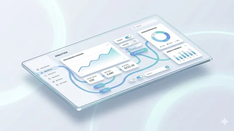
The gestalt principle of continuity (also called the law of continuation) describes our tendency to follow smooth, continuous lines and patterns rather than seeing them as broken or random fragments. In interface design, this principle helps create clear visual paths so users can “flow” through content and actions without needing to think about where to look next.
TL;DR
- The mind naturally follows continuous lines, curves, and sequences, which you can use to guide attention in interfaces.
- Continuity works together with figure/ground, similarity, and proximity to structure complex layouts into readable groups.
- Using continuation in UX/UI improves hierarchy, scan paths, and perceived simplicity of even dense screens.
- Misusing it—breaking flows, misaligning elements, or over-decorating—creates confusion and cognitive friction.
- A practical approach: define your ideal reading path, align elements along that path, and test with real users’ eye movements or click patterns.
Learn more about: What Colors Easily Manipulate Poeple
Why is the Gestalt Principle of Continuity Central to Visual Perception?
How do Gestalt principles shape the way we see?
Gestalt principles are psychological rules that describe how humans organize visual information into meaningful patterns. Instead of seeing isolated pixels or shapes, the brain looks for structure—groups, lines, and forms that feel coherent. When designers understand these rules, they can predict how people will “read” a layout before any text is actually read.
Author, designer, and educator Mia Cinelli explains Gestalt principles as “ways of making sense of a visual field”—how we parse what is figure, what is background, and how elements relate to each other. In practice, this means when we see a screen full of rectangles, icons, and text, we don’t process each item one by one. We chunk them into flows and groups based on a few consistent perceptual shortcuts.
From years of working with product teams, one pattern shows up repeatedly: when a layout fights these perceptual shortcuts, users get lost, even if the content itself is clear. When the layout works with these principles, complex dashboards or forms feel strangely simple and “obvious.”
What is figure/ground and why does “discontinuity creates figure”?
At the base of Gestalt theory is figure/ground: the distinction between what we see as the main object (figure) and what we see as background (ground). In interfaces, the figure is usually the content or control the user should act on; the ground is everything else that supports it.
A key rule here is “discontinuity creates figure.” If you have a grid of identical rectangles, they all blend into ground. Change just one—different color, size, or outline—and it suddenly pops as figure. This is why a single primary button among several secondary text links is immediately noticeable, even before users read the labels.
In design practice, this rule is everywhere: one bold card in a list of muted cards, one highlighted row in a table, one step in a progress bar with a distinct color. That small disruption in sameness tells the eye: “Start here. This matters.”
How do similarity and proximity prepare the ground for continuity?
Before focusing on continuation itself, it helps to see how similarity and proximity structure the visual field:
- Similarity: Elements that look alike (same color, shape, typography, or size) are perceived as belonging together. For example, all navigation links styled alike feel like a single control group.
- Proximity: Elements that sit close to each other feel related, even if they don’t look identical. A label placed right above an input field will almost always be read as belonging to that input.
In real projects, I often resolve “this screen feels messy” feedback simply by tightening proximity between related elements and reinforcing similarity for groups. Once users can see clear groups, continuity can then connect those groups into a smooth, readable path.
Lear more about: Translating Goals Into Heart Dimensions in Digital Products
Why Is the Gestalt Principle of Continuity Important in What Humans See?
What exactly is continuity/continuation in perception?
The gestalt principle of continuity states that the eye prefers to follow smooth, continuous paths rather than abrupt changes in direction. When lines intersect, we usually see them as two separate lines crossing, not as strange zigzags that turn sharply at the intersection.
In other words, when we see a sequence of elements that form a line or curve, we mentally extend that line beyond what is visible. This is why a dotted line still feels like a single path, and why items aligned in a column feel like part of a single vertical flow, even if there are gaps.
You’ll also see the term law of continuation or principle of continuation used for the same idea. All of them describe this same perceptual habit: our eyes want to keep going in the same direction once a path is suggested.
Why does the brain favor continuous paths?
The brain uses continuity as a shortcut to reduce processing effort. It’s more efficient to assume that a line continues smoothly than to treat every local change as a new object. This is part of a broader strategy: we simplify complex scenes into stable structures.
When we look at a busy street, we don’t track every car pixel by pixel. We follow trajectories—paths of motion and alignment. The same happens on a screen: users don’t read every element in isolation; they trace paths through aligned titles, images, and controls.
From a perception standpoint, this matters because:
- Continuous paths reduce ambiguity: the eye knows where to go next.
- Broken or misaligned paths increase cognitive load: the user must consciously decide where to look.
- Strong continuation can override other cues: elements slightly farther apart may still feel related if they align along a clear line.
How does continuity interact with hierarchy and grouping?
Continuity doesn’t work alone; it amplifies hierarchy and grouping:
- A line of increasing font sizes can suggest an order of importance.
- A vertical sequence of aligned cards creates a clear scan path down the page.
- A progress bar with evenly spaced steps invites users to anticipate the next step.
In practice, when continuity supports hierarchy, users can skim and still understand structure. When it contradicts hierarchy—say, a less important button is aligned perfectly with a primary path—users may mistakenly prioritize the wrong element.
Learn more about: What Can I do With a Design System Json File
Why Does the Gestalt Principle of Continuity Matter So Much in UX/UI Design?
How does continuity guide attention and flow in interfaces?
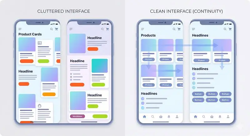
In UX/UI, continuity is one of the most reliable tools to guide the user’s eye from one key element to the next. When elements are aligned into clear vertical or horizontal flows, users can predict where to look, which reduces friction and speeds up task completion.
Based on usability tests across multiple products, interfaces that respect continuation often show:
- Faster time-to-first-click, because users quickly find the “next” element in a sequence.
- Fewer mis-clicks, as eyes and hands follow stable paths.
- Better comprehension of complex layouts, since structure is visually encoded, not just written.
Designers can leverage this by intentionally shaping scan paths—for example, leading from a page title to a key metric, then to a primary action, using alignment, spacing, and subtle visual connectors.
How does continuity support readability and information hierarchy?
For text-heavy interfaces—dashboards, documentation, forms—the law of continuation is crucial for readability. When headings, subheadings, and body text align on consistent axes, users can quickly identify levels of information.
Some concrete effects:
- Consistent left alignment for body text creates a stable reading spine.
- Aligned section headers form a vertical “table of contents” users can scan quickly.
- Columns in tables or data grids rely on vertical continuity so users can track values across rows.
When these alignments break randomly—labels shifted, misaligned inputs, uneven column starts—users experience micro-disruptions. Each disruption forces a small re-orientation, which adds up to fatigue and errors, especially in long workflows.
How does continuity interact with other Gestalt principles in UI?
In real-world UI, continuity rarely acts alone. It typically works in tandem with:
- Figure/ground: A continuous path of high-contrast elements stands out against a calmer background.
- Similarity: Repeated button styles along a path reinforce “these actions belong to the same flow.”
- Proximity: Groups of controls along a continuous line feel like a single step or section.
For example, in a checkout flow, a vertical stack of similarly styled cards (shipping, billing, review) with consistent spacing and alignment leverages all these principles. Continuation ties the steps together; similarity and proximity define each step; figure/ground highlights the active step.
Learn More about: Best Tips For Design Portfolios
What Are Clear Examples of Continuity in UX/UI Design?
How does continuity show up in navigation and layout?
In navigation systems, the gestalt principle of continuity appears in how menus and links form visual lines:
- Horizontal nav bars: Top-level links aligned in a straight line create a clear path across options. The eye sweeps left to right following that line.
- Vertical sidebars: Stacked navigation items form a column the user can quickly scan downwards.
- Breadcrumbs: A linear sequence of links separated by chevrons or arrows guides the eye along a clear path back through the site hierarchy.
In my own projects, simply realigning misaligned nav items or tightening their spacing along a consistent baseline often improves discoverability without changing any labels or IA. Users just “see the menu” more clearly because the path is unbroken.
How does continuity work in forms and input flows?
Forms are a classic area where continuation can make or break usability:
- Single-column forms: Inputs stacked in one vertical line create a straightforward top-to-bottom flow. Users rarely get lost.
- Multi-column forms: When fields are arranged in inconsistent rows and columns, users often jump in the wrong order, especially on desktop.
- Grouped sections: Section headings aligned with their fields and dividers that run across the full width help users understand where one group ends and another begins.
A common pattern in enterprise products is the “form spaghetti” problem: labels, helper texts, and inputs misaligned in multiple directions. Fixing this by aligning labels and inputs into clear vertical and horizontal tracks almost always yields fewer validation errors and faster completion.
How does continuity appear in cards, lists, and data displays?
Cards and lists rely heavily on continuation to feel scannable:
- Card grids: Cards aligned in rows and columns let users scan horizontally and vertically along stable lines.
- List views: Each row follows the same internal structure (icon, title, meta, action), creating internal continuity that speeds recognition.
- Tables: Vertical columns of values allow users to track a single variable across many rows; horizontal rows let them scan all attributes of one item.
In dashboards, I often use subtle horizontal rules or consistent card heights to reinforce continuation. Users then follow these implied lines to compare metrics or spot anomalies without consciously “reading” each label.
Learn More about: User Centered Design UCD Process
What Are Best Practices to Apply Continuity in UX/UI Design?
How can designers intentionally build visual paths?
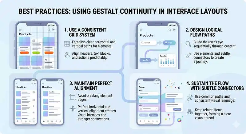
To leverage the gestalt principle of continuity effectively, start by defining the ideal user path through the screen—where should the eye go first, second, third?
Practical steps:
- Sketch the path: On a printout or wireframe, draw the line you want the user’s eye to follow.
- Align along that path: Place key elements—headings, primary metrics, main CTA—so they fall on or near that line.
- Use consistent alignment: Choose left, center, or right alignment for each content type and stick to it across the layout.
- Reinforce with repetition: Repeat patterns (card layouts, row structures) so users can predict what comes next.
In usability reviews, I often overlay simple lines on screenshots to check if the visual paths are coherent. If the path zigzags without purpose, it’s a signal the layout is fighting continuity.
What layout and spacing decisions support continuation?
Certain layout choices naturally strengthen continuation:
- Single dominant column for primary content with secondary info in a clearly separated side area.
- Even spacing between related items, so the eye perceives a rhythm along the path.
- Baseline grids that keep text and components aligned across sections.
Conversely, mixing multiple unrelated alignments—centered headers, left-aligned body text, right-aligned actions—on the same axis often breaks continuity. It’s not that you must never mix, but each deviation should be intentional and rare.
How should continuity be tested and iterated?
To validate whether your use of continuation works:
- Observe scan behavior: In usability sessions, watch where participants look first and how their gaze moves. Even simple screen recordings reveal a lot.
- Check click patterns: Heatmaps or analytics showing first-click locations can indicate if users follow your intended path.
- Run quick A/Bs: Compare a layout with clean alignment vs a more “creative” one; measure task times and error rates.
Based on experience, even small adjustments—aligning a primary button with the main content column instead of floating it off to the side—can yield measurable improvements in completion rates.
What Are the Risks and Considerations When Using Continuity?
How can continuity mislead or confuse users?
The same force that guides can also misguide. If a continuous line of elements visually suggests one path but the interaction model expects another, confusion follows.
Common pitfalls:
- False paths: Aligning secondary or destructive actions along the main visual path can make them look primary.
- Over-sequencing: Laying out content in a way that suggests a strict order when the user can actually act in any order.
- Competing paths: Multiple strong visual lines pulling attention in different directions at the same time.
For example, placing “Delete account” in the same alignment and style as the main “Save changes” button can cause catastrophic mis-clicks. Continuity here amplifies the risk.
When should continuity be broken on purpose?
Sometimes, breaking continuity is exactly what you need. Remember “discontinuity creates figure”: a deliberate break can highlight something critical.
Useful intentional breaks:
- Emergency actions: Place them slightly offset or styled differently to require conscious attention.
- Warnings and alerts: Interrupt the usual flow with a banner or modal that clearly stands apart.
- Context switches: When moving from browsing to editing, a shift in layout can signal a different mode.
The key is that these breaks are intentional and rare. If everything is a disruption, nothing stands out.
What other constraints and edge cases should designers consider?
There are a few practical considerations:
- Responsive layouts: On smaller screens, columns collapse, and your carefully crafted horizontal continuity may disappear. Plan mobile paths separately.
- Localization: Right-to-left languages invert reading direction, which affects how continuity feels. Alignments that work in English may need adjustment.
- Accessibility: Continuity helps many users, but not all. People using screen readers rely more on semantic structure than visual paths, so headings and ARIA roles must match the visual flow.
Perlu diperhatikan: continuity is a powerful but visual-first principle. It should complement, not replace, good information architecture, clear labeling, and accessible markup.
Learn More about: Bottom Navigation Bar Design Mistakes Mobile App UX
Conclusion: Applying the Gestalt Principle of Continuity in Your Next Interface
The gestalt principle of continuity captures a simple but powerful truth: once the eye finds a path, it wants to stay on it. In UX/UI, that path can either support your intended flow or fight against it.
In practice, the most effective interfaces:
- Use clear alignments and consistent spacing to create stable scan paths.
- Combine continuation with figure/ground, similarity, and proximity to organize dense information.
- Break continuity sparingly and intentionally to highlight critical moments or actions.
- Validate visual paths with real user behavior, not just aesthetic judgment.
For your next design, start by asking: If I had to draw the ideal line a user’s eye should follow on this screen, what would it look like? Then use continuity—through alignment, rhythm, and repetition—to make that line real.